Who doesn't love the Borg? The Borg always held a special place in my heart (the mechanical part) because despite their almost entirely ominous presence in Star Trek, there's something charming about them--almost silly.
This piece was created for a Star Trek/Star Wars-themed group show. Star Trek was sadly underrepresented because everyone is a Star Wars dork. I'll be the first to agree that the concept of a Borg Queen as seen in First Contact makes no sense, but she worked well for the image. I was going for the feeling of a propaganda poster, something advertising the pros of being assimilated. I kind of wanted to portray the Borg as they might see themselves, as kind of messianic, uniting the galaxy. Borg Queen herself was modeled on Mucha's females as well as Midna and some of the imagery* from from Zelda: Twilight Princess. I think I made the Queen much more stylish, plus I really like how the pixelated-type detailing of the dress came out.
I considered making some other sci-fi-themed images in the same stylistic vein, but was never able to. Honestly, I wouldn't know what to do.
*image credit Donna M. Evans, who I found via Google just now. That picture is super cute.
 Okay, more fangirlism. I'm sorry.
No, I'm not.
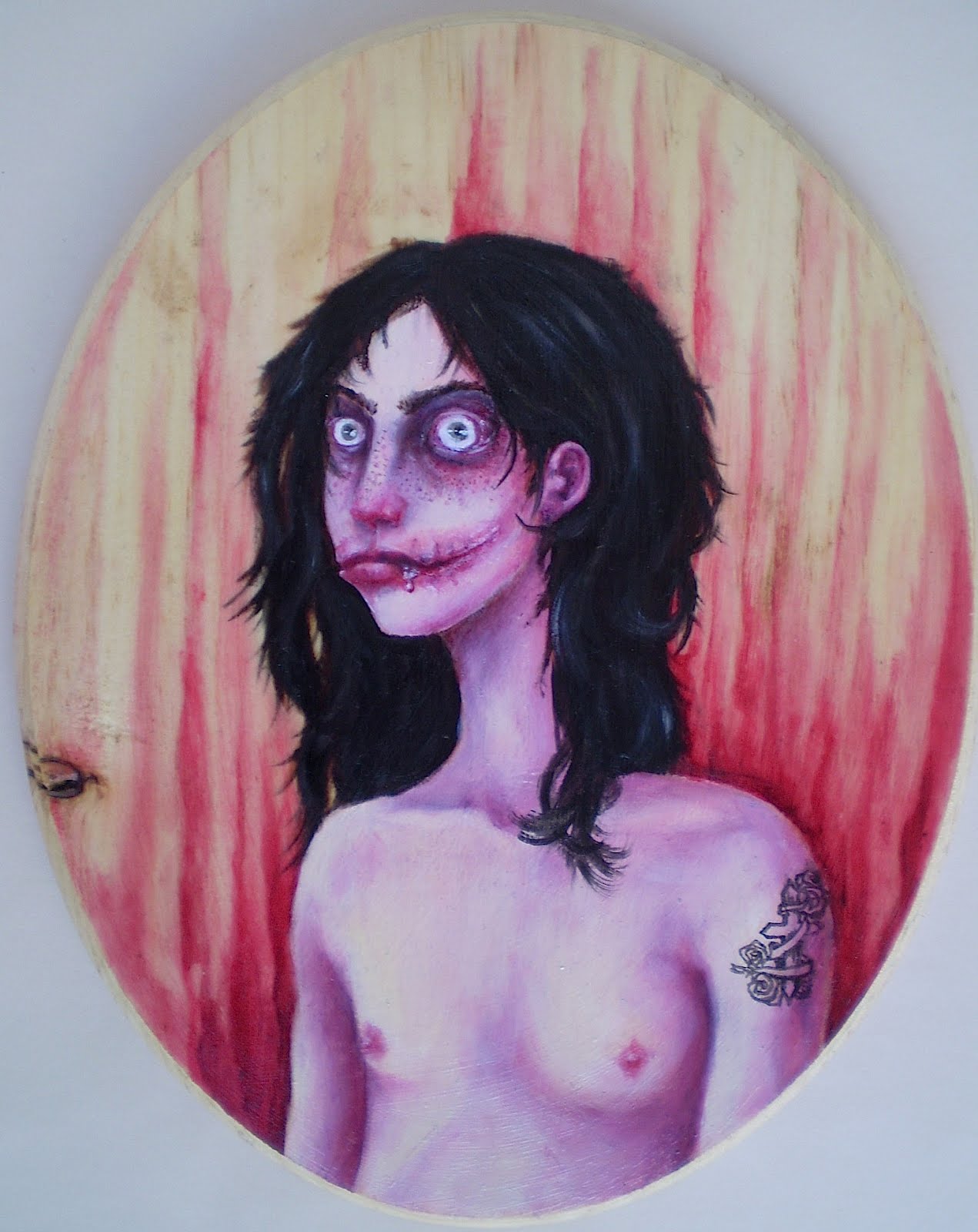
Okay, so here's (probably) the last and most intricate piece I'll be displaying that has to do with Jeff the Killer. After viewing thousands of images of him and his supposed likeness on sites like deviantART, I found myself becoming irritated with many of the images because they seemed totally unrealistic, and I think I'm a hardcore realist at heart. So I decided, as I usually do when something pisses me off artistically, to take matters into my own hands.
This is the result. I first started off thinking about what would happen, after some time, to someone's face after they'd given themselves a Chelsea grin, and figured there would be a lot of scar tissue involved, as well as a considerable amount of regrowth. With a portion of the cheeks open past the natural boundaries of the mouth, someone like Jeff would also probably have something of a drooling problem. Ew. The eyes, of course, which are often portrayed as ringed in soot (the eyelids were, according to the Pasta, burned off with a lighter, though I still think that would cause irreparable damage to the eyeball itself), though after time they would only be surrounded by more scar tissue. I've seriously never thought about facial mutilation quite this much before.
The face itself is modeled after my own. One of the reasons why I like this character so much is because one of the core themes of his story is the concept of beauty, of finding one's own definition of beauty against societal odds, and relentlessly pursuing that idea. Thanks to my own body modifications, I've experienced the OH MY GOD WHAT DID YOU DO TO YOURSELF quite a number of times. It's hard to explain to someone who has a very fixed idea of what is and is not beautiful you idea of beauty, that beauty is subjective, not objective, and that one idea of beauty is no more or less valid than another. I also know how it is to feel as though the physicality you have is a liability, and how it feels to want to confront peoples' shitty and exploitative concepts of (female) beauty in an aggressive manner. There was one time, a long time ago now, when I had a passing fantasy about cutting my face open like that. I really did--I even wrote about it when I used to keep a journal. I'm not proud of it, but it's true. Nothing ever came of it because I have better self-control than that, but it's still part of my history.
If you don't know, a very distilled version of the Jeff story is that Jeff mutilated his own face and subsequently thought of himself as beautiful. This concept of challenging the commonly-held ideas of beauty, of forcing people to look at something they've been trained to see as ugly as something beautiful is interesting to me, because I do believe that the truly beautiful things are the things that make you think and feel deeply--and often, the truly beautiful things are going to make you uncomfortable, make you afraid, and make you hurt. You don't escape from real beauty unscathed. As I've said before, when it comes to creating art, I find it much more fulfilling for everyone to create something that is uncomfortable but stirring than pleasant but superficial. Beauty and terror and ugliness and transcendence, to me, are all wrapped up in another as facets of the human experience.
I also should tell you that I am way over-analytical and make a big philosophical deal out of things like Creepypastas.
And because of all that, Jeff looks something like me, with big lips, freckles, unkempt black hair, and dark circles under the eyes. I gave him light eyes, though, as it fit better with the original image. He's also got a tattoo for some reason, I couldn't tell you why, but I think it stemmed from needing something dark at the base of the image to balance out the hair.
From a technical standpoint, this is the first time I've used gloss medium (clear) on wood, which allowed me to work with the natural forms of the wood, which was nice. Besides, wood knots, like the one seen here, have a way of insinuating itself through many layers of paint, and so I figured I would work with it rather than fight it. I chose a pink scheme because it seemed natural, plus I really like what pink glazes do for skin tones. Because of the pink and the sort of low-brow inspiration for this piece, it's being categorized in the Trash body.Today I bought another one of these wooden ovals so that Jeff can have a companion.

Finally, a new oil painting. I have been shamefully remiss about painting, and so I'm thrilled to have a new one.
The working title for this is just "Little Maskies," which is stupid, but I'm having a hell of a time thinking of anything decent. It's oil (stand oil glazing) and glitter on canvas, and is based on a photograph I saw on Boyfriend's aunt and uncle's refrigerator in Pennsylvania. It was of their relatives or something on Easter, during an egg hunt, and they were wearing these weird masks and looking unsmiling into the camera. I only had a quick impression of the original, and this is what it became.
Photographing it was a pain; stand oil is so shiny that it's nearly impossible to get a picture without a glare. Even if you think the light is diffused and indirect, it'll show up as a huge, distracting glare in photos. After about 24,596,984 times, I finally got this one, and there's still a glare on the left side. But it's okay.
I've lately been into paintings with large areas of amorphous, atmospheric, washy colors, which are dominating the projects I'm currently working on. I have two actively going and two more in the unstarted phase. I haven't worked with stand oil in a while and I'm excited to start up again.
In terms of the themes I usually work with, this one is a bit different. I'm categorizing it under the Home collection, but it has a number of differences. For one thing, much of the Home body was not created using stand oil, and none of them involve glitter. Glitter has been heretofore reserved for the Trash collection, but it shows up here, in the masks. The figures are different, too. They share some of the silhouette qualities of hoodies, but, obviously, have no hoods. They still, however, retain their air of mystery, having part of their heads/faces covered.
I also have a real thing for trees silhouetted against the twilit sky. It's just so pretty.

 As promised, here's another installment of Artists You Should Know to make up for my lack of talking about people other then myself.
Today we're talking about 
 Marion Peck, a
 California-based painter whose work reminds me of a slightly unholy cross between Flemish Renaissance painting and seventies kitsch, complete with sad clown portraits (Polka Dot Clown, this one is called).
Her work's gentle pastels and the feminine detailing, as well as their "cute" figures with the large eyes, cartoonish proportions and clear skin belie the darker, more uncomfortable subject matter. There's also a weird balance in the paintings, I think. It's hard to tell if there's a lot going on--in terms of both symbolism and actual objects--or if they are empty and waiting for the viewer to project their own ideas into them. That idea, I think, is most evident in Landscape with Submerged Deer, where a deer reminiscent of kitschy figurines floats beneath a murky green lake surrounded by slightly disproportionately small mountains. It's like a snapshot from a dream. It seems like it must have a meaning, but does it? I know for me, it brings to mind the time I went swimming with some friends in High Falls, amid the rocks and waterfalls. On getting out to go home, we noticed a weird smell, and realized we had been swimming with a dead deer that was lurking in the water behind the rock where we had placed our clothing. A set of hooves floating in the green water.
It was a nice day anyway.
Anyway, Peck's work also balances the old with the modern. Her painting is undeniably modern, with the Kewpie-like human figures, but it also speaks to a much older tradition. The two paintings of single female sitters, Fuck You and Gretchen, are both dressed in historical costumes; an empire-period shift dress for Fuck You, and a peasant dress and wimple for Gretchen. They could be traditional portraits in the historical sense, but they are both very much modern. Gretchen had the enormous head of a cartoon character, and Fuck You is flipping us off in a very nonchalant way. Finally, The Salmon Spirit has some of the same qualities. The idea of an animal spirit is a very ancient one, as is the metaphor of the journey of the salmon (the banner reads "We begin/We journey/We return"). It calls to mind the indigenous cultures of the Pacific Northwest, but at the same time, the child floating above the salmon has a modern, blunt-bob hairstyle and the face of a baby doll.
Peck's work shares many traits with the so-called "lowbrow" artist movement: big eyes, kitschy elements, lots of pastels, etc. I tend to like these artists, and I like Peck because unlike some of the artists associated with the movement, her work shows a little more variation. I also appreciate the influence of Flemish painting in her earlier work, where landscapes through windows serve as the backdrops for her figures.
 I had some trouble classifying this painting (and I do so love to classify), because its attributes fall into both the Home and the Medieval categories of my painting. It's on fabric, and features the painting style that I usually use for the Home pictures, but the clothing and composition, as well as the inspiration, are more in keeping with the Medieval style.
The title, Ai Vis Lo Lop, is Old Provencal and translates to "I saw the wolf." It's also the title of a song, which was the inspiration for this piece. Here are the wolf and the fox, meeting under the tree. There's also a rabbit mentioned in the song, but I think they ate it. Fun fact: the term "seeing the wolf" was also a slang term for losing one's virginity. So take that as you will.
I had a lot of fun painting this one, and I'm very happy with how the faces came out in particular, and I tried to keep them as close to the sketch as possible. I really like using pink in faces. That's me on the left as a little black fox, and Beastie on the right as a gray wolf. This was also the first time since I was about six that I've drawn anybody with animal ears, and I was a bit apprehensive about it, especially after seeing all the furry/anthro/neko-neko-kawaii bullshit the Internet has to offer. I like them, though, and I was thinking of it in terms more of medieval-style pageantry than literal anthropomorphism.

 The time has come to end the sketchpad series. It's sad, I know, but my poor pens are suffering from exhaustion and quite frankly, I'm tired of the sketchpad. Like, really tired.
So here are the last two pages of the sketchpad. My .01 pen was fading fast, so as you can see, I resorted to using a .08 for the backgrounds of both of these. I don't like the heavier line quite as much as I do building up layers of finer lines, but it's passable.
Up top we have another Jeff. Seriously I am the sickest fangirl for him, because I have a thing for long-haired guys with crazy eyes, toothy smiles and big knives. I don't know what that says about me, exactly, but I'm okay with it. He's seen here after a long and productive night cleaning his knife off. Pasta-monsters have a pass when it comes to blood-borne diseases. Jeff's .08 background actually came from necessity, as there was some Prismacolor marker bleed-though from the other side of his page that had to be covered. And you always have to cover up the bleed-through, right Jeff?
Next is a portrait of me and Beasty. I'm not 100% thrilled with this one, but I wanted a picture of the two of us and here it is. I struggled with this for a long time, going through about a thousand pencil versions--the remnants of which you can still make out in the white areas of the image--before settling on this one. I was originally going for something a little sexier, but it never quite worked the way I wanted.
I salute you, Sketchpad. You will be missed. Kind of.