So I've finally, finally been able to complete a new painting! This is Way Down in the Valley, a kind of spiritual successor to The Valley, which I completed a few years ago. It has the same elements, double portrait with skullheads, but this one is, um, better.
These figures started off looking like this. Why would I create extremely detailed faces just to cover them with skull paint, you ask? Because I am quite out of my mind, obviously. But from a practical standpoint, it looks better. After all, if you apply face paint, you're applying it to a preexisting surface, full of color and texture, which will inform what the end result looks like. So that's what I did here. I created the faces, and then applied the makeup on top. Which I essentially explained in the last post.
There's also glitter. I haven't used glitter in a while, which is a shame because glitter is singularly fantastic.
The idea behind this painting is the same as the idea behind The Valley; it's about true love, and how loving someone truly means accepting the darker aspects of their person, going down into the valley with them and accepting the fullness of their personality and psyche, not just picking out the parts you're comfortable with.

Finally, a new oil painting. I have been shamefully remiss about painting, and so I'm thrilled to have a new one.
The working title for this is just "Little Maskies," which is stupid, but I'm having a hell of a time thinking of anything decent. It's oil (stand oil glazing) and glitter on canvas, and is based on a photograph I saw on Boyfriend's aunt and uncle's refrigerator in Pennsylvania. It was of their relatives or something on Easter, during an egg hunt, and they were wearing these weird masks and looking unsmiling into the camera. I only had a quick impression of the original, and this is what it became.
Photographing it was a pain; stand oil is so shiny that it's nearly impossible to get a picture without a glare. Even if you think the light is diffused and indirect, it'll show up as a huge, distracting glare in photos. After about 24,596,984 times, I finally got this one, and there's still a glare on the left side. But it's okay.
I've lately been into paintings with large areas of amorphous, atmospheric, washy colors, which are dominating the projects I'm currently working on. I have two actively going and two more in the unstarted phase. I haven't worked with stand oil in a while and I'm excited to start up again.
In terms of the themes I usually work with, this one is a bit different. I'm categorizing it under the Home collection, but it has a number of differences. For one thing, much of the Home body was not created using stand oil, and none of them involve glitter. Glitter has been heretofore reserved for the Trash collection, but it shows up here, in the masks. The figures are different, too. They share some of the silhouette qualities of hoodies, but, obviously, have no hoods. They still, however, retain their air of mystery, having part of their heads/faces covered.
I also have a real thing for trees silhouetted against the twilit sky. It's just so pretty.


 It was apparently a time for re-doing
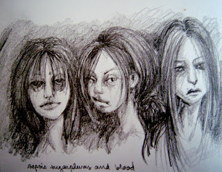
  things. Sometimes spending some time apart from a piece of work allows you to see more clearly the problem areas, and then you can go back in and make the necessary adjustments. First up was Caligula Rape Face and his non PC title. Which is still the same, mind you. The original image, which I've uploaded here, was completed some time last summer (I think), and I was only partially pleased with it. But after spending so much time together, I couldn't think critically about it. So recently I gave him some major reconstructive surgery and I'm liking how he turned out. I fixed the face to better resemble the person it's based on, added detail to the face and hand, made the hair fluffier and added a yellow color, and made the body stand out more by adding white and blue glazes to the preexisting pink ones. I also fancied up his cross necklace a bit, and changed the bird skull into a rabbit skull. And of course I added MOAR glitter and some cute little pink heart sequins to the bottom. And yes, I'm still using Martha. I'm really happy with the face now, and the original looks totally crappy by comparison. This is also the first oil painting I've (re)completed in a while, which is a nice feeling. The next image isn't so much a re-do as a different version of a sketch. The original Sepsis, Sugarplums and Blood is a simple pencil sketch from my sketchbook (there's my curly little handwriting at the bottom), and was drawn after a weird night with some friends. I later developed it into a water media piece, using watercolor, ink, watercolor pencil and gouache on Arches paper. I didn't originally intend for them to have neon hair like that, but I like how it turned out. Also, I once did have purple hair like that. What I like about the two of these when seen side by side is the facial expressions, which are all different, but equally likeable. Each picture communicates a distinct mood, with the pencil sketch being somewhat sadder and more nihilistic (which was kind of how I was feeling after said night with friends), and the water media one is happier. I also thought the fly on the orange-haired one was a nice addition. That was Beast Boy's idea.
 So here's another Trash item that was supposed to have a mate that I never got around to finishing. It's full of Martha Stewart glitter and religious imagery and general debauchery. If I don't upload it now it'll never get uploaded, so here you go.
This is Caligula Rape Face. At least, that's been its working title for a while now. It's not terribly politically correct of me, is it? I'll often come up with shitty names for paintings while I'm working on them, usually out of sheer annoyance, and they either will or won't stick after the painting process is complete. This one stuck, perhaps unfortunately. I don't know what to tell you.
Anyway, this is a stand-oil painting made with like an entire tube of alizarin crimson and Martha Stewart glitter in Tourmaline (which is a mineral and actually comes in a variety of colors, but Martha is referencing the dark pink kind, I guess). Collaged into the top corners are Jesus, left, from the Godescalc Lectionary, and Shiva.
You'll notice that the figure, which was derived from a photograph, is wearing pearls. This painting taught me something: painting pearls is annoying. The bird skull, however, was a lot of fun. On the whole, the painting, part of the underrepresented Trash body, is about holy debauchery and general sacrilege.
I don't know how much I like this painting really, and there's an off chance that I may return to work on it, making improvements here and there, refining it a bit, but I felt for honesty's sake that its current form should be shown. Maybe one day I'll even get around to finishing its partner painting. Stranger things could happen.
 So, wow, I can't believe I forgot about this one. I sort of took for granted that it was posted here.
This was completed in the winter of 2009-2010. It shows the secretive Ladybug Death Cult, a religious society that worships the ladybug as a symbol of death and transcendence. They are rumored to practice human sacrifice...
36 X 48 inches, oil, collage and glitter (Martha Stewart, of course) on canvas. It was actually inspired by the fact that during the winter in which it was painted, scores of ladybugs came into our house, looking for warmth, and promptly starved to death, leaving their spotted little corpses everywhere. I mean, everywhere. Finding a ladybug used to be exciting, and I still like them, but that experience destroyed some of the magic.
Anyway, this painting hangs in my room, near The Pardoner, and looking very nice against my pink walls. Enjoy.


 If you look to the right hand side of this blog, you'll see a quip about cupcakes in the "About Me" section. It's true. I do find cupcakes, and all gooey baked goods, for that matter, to be somewhat sinister. I don't know why. Something about all that prettiness and sweetness...you just know it has to have a dark side.
I made these paintings a few years ago, when I was tired of using the darker, more jewel-like tones of the medieval-style paintings and wanted to do something a little brighter. I was also interested in the idea, especially after working with ideas informed by sacred art, of the line between high and low culture.
So I went out and bought some glitter.
Because glitter, many believe, has no place in good, grown-up art. It's for kids. But I say not so. First of all, I don't use just any old glitter. I use Martha Stewart brand glitter, which is seriously the highest-quality glitter I have ever seen, and comes in a wide variety of colors not generally associated with glitter (olive green and brown, for instance). I also bought Martha Stewart brand cupcake wrappers, some of which were collaged onto this painting and some of which were used to make actual cupcakes. Martha has a section dedicated to her wares in craft stores like A.C. Moore and Michael's, and a good time can be spent there pondering over how anyone could come up with this stuff. Say what you will about Martha, she knows how to make fancy, useless, amazing crap like a pro.
These paintings are the first in which glitter is used. For these, I mixed the glitter with neo megilp, which I had been using for the rest of the glazes, to create a glitter paint. The glitter use, compared to what I've been doing lately, is modest, and even hard to see in these pictures (it's mainly on the wall behind the figures, accenting the designs there). I've also found that I prefer using it with stand oil--because stand oil makes everything better. They are also the beginning of what I've been informally calling the "Trash" line, which uses a lot of pink and glitter and really bad taste as a way to explore the ideas of what taste is, what is acceptable as far as art is concerned, and what kinds of implications arise by using childish (and typically feminine) colors and symbols and calling it art.
The Cupcake Diptych is unfortunately quite delicate. Besides the collaged cupcake papers, there's a brittle batch of gesso underneath which requires they be kept in a safe place (like, not my closet). I'm not, looking back on them, quite satisfied with them as far as the modeling goes, but I can appreciate them, at least. More Trash coming soon!


