Showing posts with label self-portraiture. Show all posts

Sunday, December 21, 2014

after a good long while

 Well, I've certainly abandoned this blog for quite some time. The last six months have seen some major transition, including me getting a new job (hooray!) and basically being an adult. I also got to hang my first NYC show, and also my first show since moving. It's been a pretty good six months, actually, especially in the job department. As a result, I've been sort of viewing my life in the past year-and-a-half or so in terms of When The Old Job Was Good, When The Old Job Sucked, and The New Job. These were painted in the middle period, probably in the spring and summer of 2014, all in the second of the two spiral bound notebooks I used to haul around to occupy myself and mitigate anxiety. 

First up we have two WelcomeTo Night Vale pieces. The top on is Each Named Erika (with a K), in reference to the angels. Canonically, they have non-human, oblong heads and are sexless, but I decided to model then after people I know (including my favorite model), who are sexed and have less-than-oblong heads. I also gave them some floating planetary symbols and multiple eyes. This is the only one of the WTNV pieces I've done that doesn't incorporate text. 

Next we have Intern Dana, another Night Vale character as she goes on her somewhat spiritual journey through the desert on the other side of the door, encountering a mountain and growing exponentially to become mayor material. To be honest I have fallen out of listening to Night Vale and I'm some months behind. The new job is less conducive to podcast listening, so I've been slacking off in all podcasts. A lot of the WTNV fan art I've done (as well a lot of other art) features triangles pretty heavily. Because I really like triangles. 


Following that is one of the few horizontal pieces from the notebooks, called Closer to the Moon, based off night vistas from home and that feeling when the moon seems surprisingly close. 


Perch was a spring piece, getting back into the mint greens and quaintness. It's, um. It's a big bird. I don't know, this was kind of just a spur-of-the-moment thing. This was during a pretty depressing moment of When The Old Job Sucked (like, more so than usual), and I might have been trying to make myself feel better. 
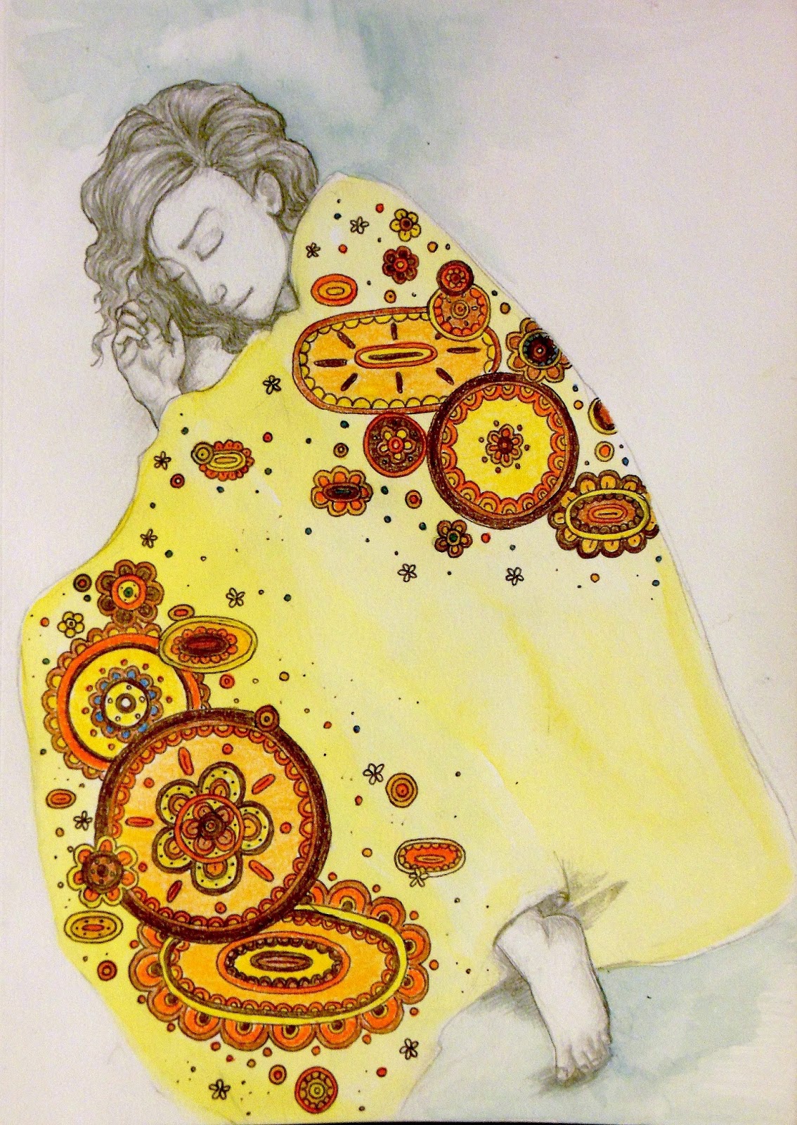
 Sensitive kind of came out of the same thing. If I remember correctly, this one was started sometime in the late winter, but kind of abandoned for a while.  While everything else in this selection is a watercolor/ink/gouache mix (except for Closer to the Moon, which is acrylic), this is pencil. 
 Here we have The Editors, with a throwback to the the massive black blob bodies of the medieval tradition. The name came from a work reference, actually (old job), and I sort of posed them as a mysterious, esoteric council. The tallest figure is modeled after someone who was not, actually, an editor and who has managed to sneak into a few other pieces, including possibly as the central figure in Each Named Erika
And lastly we have Camp of Hearts. This was another one that took a long time to materialize, and I actually had the title before I had the actual image. That's not uncommon in my personal process. I think the title came from misreading something that actually said "camp of the arts," as in a summer camp with art programs, but my strange brain turned it into something else. That also happened with What Double Vein, where I misread "what do you believe in." This not only came from the misreading, but I think was also inspired by movies like Moonrise Kingdom and a camping trip to Ithaca. I wanted something genuinely wholesome and classic, with a warm, nostalgic sense. 

There are actually considerably more art pieces I'd like to include here--I've been surprisingly prolific, even if it's only with small things. Currently I've been waging war on/avoiding Christmas, but hopefully over the holidays I'll be able to do some larger-scale pieces. 
Hooray!

Thursday, June 12, 2014

forays into digital art

So I got a Wacom tablet! It's pretty nifty, and I've been playing around with it. It's nice because I can sit on the couch and watch movies without fear of spilling anything. I've been using ArtRage, which is a terrible name, but it's a pretty good program for a beginner, and easy to figure out without much difficulty. The biggest challenge to learning the digital stuff is the disconnection between your had and the line being created. I'm more used to the directness of traditional media, so it took a bit of getting used to not actually touching the piece I was working on. I still have a few things to learn, and I may get some better software because while ArtRage is decent enough, I'd like some more options. So here's what I made!


This is tentatively titled Dome, and I was channeling '70s sci-fi novel covers. The geodesic dome was fun to do, and I got to appreciate layers to the fullest. This features some nice lurid colors and some kind of sexy android girl. I think she's an android; it doesn't really matter. Also triangles. 


The second one, Runaway, is named after a song of the same name by the Yeah Yeah Yeahs. I was listening to it on the walk home and constructed a narrative. I'd like to do more with this concept, and was thinking of making some concept art for that video game I'm totally going to make with all that time and money I have. (Sarcasm!) The ruined city was fun to do, if time consuming, and I'd like to work more on this subject. Again, there's some retro sci-fi thing happening, and for the larger project, I was thinking of incorporating that with a sort of Arabian architecture theme. 


Finally, we have Wheat, which may or may not have been inspired by the Untappd. I'm happy with how the faces came out, and for some reason I gave it a vaguely Polaroid-like border, but I think it works here. 


So in all, I'm liking the digital art. People, especially non art people seem to have the idea that you can be in one of two camps on the subject of digital vs. traditional media, which is dumb, really, because there's no reason why liking something necessarily has to mean not liking something else. I'm still kind of getting my footing when it comes to digital media, figuring out how to best use the options and what styles work best with it. Personally, I don't think I'll be setting out to make digital paintings look like traditional oil ones--that never looks good. I kind of like keeping the digital stuff cleaner. I also like working with limited color palettes with digital and keeping things on the simpler side, and I'd like to do more with patterns. We'll see where it goes from here!


Friday, April 4, 2014

geometry & girls, forests & fog, rabbit eaters & kings.


The thing I like about the notebook I've been using is that it allows me to quickly fire off smaller-scale projects. In the past, many ideas were relegated to a pencil-only sketchbook and never really got to evolve, or they were made into watercolors and then lost in the morass that is my art file in my desk. The notebook, though, allows me to keep everything in one place as well as create full paintings. All of these come from the same notebook. And it's spiral bound! That is a really, really big step for me. One of the things I was doing was collecting words and phrases I found interesting and creating images to go along with them. (Note: everything here is 7 in by 10 in, for size scale)


From the top: 
A Million Girls. I think the line might be from a Raveonettes song. It's water color and ink.  It was also featured in Inconnu Magazine's "All Things Roll In."

Rare Geometry. Watercolor, ink and acrylic. The name came from an article (that I sadly can't find now) on the structure of the universe, and this phrase really stood out to me. Also, interference paint. 


The High King. Acrylic, watercolor and gouache. This is actually the second incarnation of this title; the first is still in the works. The title originally came from the Disparition song of the same name. The first one matches the music a little better, but I still like this version as well. 


Rabbit Eaters III. Watercolor and goauche. I completely love these little guys. I have this whole little story about them in my head, where they are small, naked people who live in the woods and eat rabbits, and have white eyes and red hands and arms, and they like to wear twigs in their hair. The latter might just be rabbit blood, I don't know. But they're really cute. 


Interior Forest. Watercolor. It had been a long time since I did some weird ribcage stuff, so here you go. It's also rare that I ever make a female figure with light hair (that isn't me as a kid). There isn't, I suppose, much to say about this one, though I am working on a sister ribcage girl. 


It Came from the Bathtub. Watercolor and ink. I bought green gel pens just to make those little algae guys. I work very near an art supply store and resisting things like interesting pens and tiny notebooks is really, really hard. Anyway, this is a self-portrait! I thought of it while taking a bath. I normally don't take baths because sitting in bathwater grosses me out, but I was in need of some girl time so I was hanging out reading magazines and listening to Hole when I noticed that the bathwater was green. Not gross green--it was kind of pretty and interesting. 


Self Portrait in the Fog. Watercolor, ink, gouache and acrylic. Naturally there needed to be triangles somewhere. Here I am at the end of winter, in my plaid coat and my awesome boots and my general feeling of absurdity. 


Friday, December 6, 2013

in which we finally have a new oil painting

Okay, so! Look you here! It's a real live oil painting! I started this, oh, some months ago and finally finally finally finished it a few weeks ago. It took me some more time to photograph it, since all the lights in my house are yellow-tinged and I never see the light of day anymore thanks to work and the early night time of the Northern Hemisphere's winter. But I worked from home today, so I got to take this out to the alley and photograph it. The lighting was perfect, too (brightly overcast) and I didn't get hit by any cars. Success. 

This is What Double Vein, 36 x 36 inches, and I think it's about inspiration but I'll get back to you on that. I'm beginning to notice that the Home and Medieval bodies of work are beginning to merge, resulting in these patterned, foresty places full of mysterious crowned and robed figures. Back when I established the concept of three separate bodies, I always had the hunch that they would, eventually, merge into one. I'm beginning to see the Medievals also absorbing some of the characteristics of the Trash body, which has been turning up in a lot of watercolor pieces. So this is all very interesting to me. 

Lately I've been liking incorporating geometric shapes into images of more organic elements, so we have some trigons happening here, as well as some headpieces--I'm particularly pleased with the one on the left. 

By the way, you can check this blog out on my sweet new website in the blog section. 


Sunday, June 2, 2013

winterkins

Finally some oil paintings! Being separated from my oils is rough, I tells you. 

These two are painted on 4inX4in wood panels, which were coated in gloss medium so the grain of the wood is still visible. 

These are my Winterkins, created initially back when the weather was colder, and they're sort of like the embodiments of winter. I was inspired by the recent fashion trend that involves a lot of cultish, quasi-spiritual and occult elements, and the results have been sleeker, starker fashion choices for my figures. As well as a lot of triangles. It's a combination of ancient and medieval symbolism and designs, 1970s-style fantasy illustration, and the more naturalistic elements from my older work. The result is a lot of natural, complex details combined with larger areas of flat, geometric space, and is something I find really aesthetically pleasing. 

They're also portraits. The figures are the same as those in The Universe, and are basically me, in black, and Beastie, in white, along with the things I've come to associate with each of us: trees and crows for me, bones and rabbits for him. 

As for the process, painting on wood is fun. It's nice and smooth. The only downside is that because it's so smooth, it's easy to wipe the paint back off during the painting process if it gets built up too thickly. So these were made using a lot of thin layers and glazes. The other things about very smooth surfaces is that dust and debris show up really easily, so you have to be diligent about keeping them clean. 

I'd like to do another pair for summer (the Summerkins), but I still have to work out their details. They will remain with the same color schemes, though some of the elements may change. 

Friday, April 12, 2013

water media madness

 I was terribly, and pleasantly, surprised to find that THIS is what it looks like when you use water media on fabric. I had tried it before with some small pieces, but it works really well on a larger scale, too, and can be built up to a decent opacity. 

I was originally going to hang these on our closet doors at home, kind of a his'n'hers sort of thing, but the doors seem to be made of diamond and cannot be pierced by the pointy things of man. So they live on my desk. 

Up top is some beast boy creepiness, complete with blood and pointy claw fingers. And a hair bow. I used Mod Podge to seal the fabric on this one, and I'm not sure if it was that or if it was just not stretched properly, and so the fabric buckled slightly. It didn't effect the outcome, really, but was not as pleasant to paint on. This is primarily gouache, tinted with watercolor.

Below is some fashionable witchiness. This one was created using gouache and watercolor as well as India ink, acrylic paint and gel pen. REMEMBER GEL PENS??? I bought some bright pink gel pens a while ago on a whim because they transported me back to seventh grade, where the cool thing to do was to scrawl all over yourself and your friends with smeary opaque ink. They made the finer pink branches near the bottom, and were fun to use. 

So, they're not oils. Nothing is oils. But they were fun to make, and I got to play with lots of interesting ways to combine colors and materials. The only thing about this, which I discovered the last time I tried this, was that because of the primed surface, the paints will wipe right off if they get wet, so I might want to spray seal these sometime. Although, during the painting process, this feature actually came in handy as it served as an "eraser" of sorts. 

I really like bright pink and I need to use more of it. I've also found I really like designing costumes and painting fantastical clothing, and will be continuing this trend.

Sunday, December 9, 2012

endings, beginnings, and such

 It liiives!

This blog, I mean, as well as my art-making. It's been going well, I guess. I had two gallery shows in the past two months, and have contacted another one regarding showing (haven't heard back, though). I've been working on two new paintings and am probably going to set up for a third, which will be nice and bloody. Yay!

In the meantime, have the first and second installments of a small illustrated story I've been working on. I'm calling it The End or the Beginning, because that's what it's about. 

See, I don't normally use art as a means to directly express things going on in my personal life. My personal life affects my art, of course, but I'm not usually prone to illustrating it literally. This series, however, is close to doing that. Obviously it's not literal literal (I don't know people who habitually wear burlap sacks on their heads), but this series is about something I went through over the summer, which was both an ending and a beginning for me. It also corresponds to some writing I did about that issue, and some of these images are direct illustrations of those writings. 

Again, I don't make comics, and this is probably the closest I can comfortably get to making something akin to a comic (Duck vs. Cactus notwithstanding). On a technical note, I'd like to bind these, but they're all on separate pieces of paper, and I'll have to finagle something.

Sunday, July 1, 2012

knives

So I'm shirking my "Artists You Should Know" habit, but my brain is somewhat fried and I already know what to say about this piece, which I banged out on a whim. Next time.

In the meantime, have this.

I'm calling it With A Knife With A Bigger Knife, which comes from one of my favorite moments in The Venture Bros. It's oil, leaves, pen and bloody tissue on canvas. Yes, it's real blood, but it's not mine. And yes, I know using bodily fluids in art is very "art school," but at least it's not period blood, so that's a start.


I used acrylic gloss medium to glue and seal the tissue down to the canvas, which caused it to bunch up and shred a bit, but creates an interesting texture. Unlike my actual paintings, I didn't have a set plan for this one, and frankly I'm surprised that I'm pleased with the result, because usually when I don't plan ahead, it's a disaster.


I sketched out the portraits of me and Blood Donor in Micron pen, and doodled in some atmosphere and vegetal forms with oil, and applied some dyed leaves, again with gloss medium. 


Honestly? I have no idea about this one. 


I like it, I'm sure of that, but it seems to serve as kind of a place holder between larger, more serious pieces. It's a fairly straightforward double portrait of me and the boyfriend. We like knives. It was admittedly kind of a throwaway piece. It's very small, only about maybe 9X9 inches, and served as something of an experiment.


It's also thematically related to a larger piece I have planned, which will use the brown and blue color scheme, the double portrait, and a sense of the cycle of life and death (though this one is more death-oriented) and of being two small people in the world. 


The sad thing is, this is pretty much all I've been able to do now that I have a Grown Up Job which requires forty hours of each week plus commuting. The upside is that my commute is really nice, and part of that is the ability to sleep through parts of it; I take the train. The commute was actually, in part, what inspired the larger piece I mentioned above, as well as some writing. I've also taken a position as a contributor with an online publication, and recently got my first article published with them. So everything is pretty peachy on the "being an adult" front, but the drawback is that it leaves me less time for painting. Also, the access I had to a digital camera was again shot down by shitty technology, and so this, unfortunately, had to be taken with my iPod, hence the less-than-ideal image quality. I'm hoping to either get one or both of the cameras repaired and, if that fails, get a new camera. Although the prospect of blowing yet another paycheck isn't a welcome one.


And despite the knives, the blood was not acquired through any violence on my part. Today's lesson: don't try to shave when you're drunk.

Tuesday, May 29, 2012

coming soon

 So I've been working on a few new things--mainly, two new things. And here's a sneak peak of one of them! 

Both pieces are oil on canvas, and for both I'm taking a very traditional figure-painting route, lots (and lots and lots) of glazing and attention to minute detail. I am really, really happy with how the eyes turned out. I spent a lot of time staring creepily into the eyes of friends and relatives to see how they look, where the highlights are, and how to create the sense of depth and texture in them. These are Neo Megilp glazes, but the painting will have some stand oil in it as well.

These photos are already somewhat outdated, as I've been working on these steadily for quite some time. I've lately been liking the sort of Renaissance-style approach to painting, with lots of underpainting and glazing, and a multi-step approach to creating the human form. Since skin is translucent, I feel it's the appropriate way to really capture the luminosity and depth of human flesh and faces--like the way light comes through the skin of noses and ears, and how the skin gets thin enough to see the blood vessels around eyes. I've always been impressed by paintings where, when you look at them, you know what the surfaces feel like, even though it's just mineral paste smeared on a piece of cloth. The Waterseller of Seville by Diego Velázquez is one that always struck me. Looking at it, you know exactly what those pitchers of water feel like; the one on the left is smooth, heavily glazed and somewhat hefty, while the one on the right is rougher, and cold from the water inside. You can feel the condensation on your hands. It's just amazing. 


Anyway, to get back to this painting, that's what I want to achieve, but with people. Oh, and I should mention that these faces are going to be covered by some skullhead makeup. Not entirely, I'm not masochistic enough to do all this work to completely mask it, but yes, they're going to have skullheads. So why am I doing all this work? Because it'll look better. Look, when you put makeup on, you have a face underneath. The colors and textures of that face inform what the makeup is going to look like, so it stands to reason that this would also be true in a painting. Don't look at me like that. I'm just being insane thorough. The skullhead bits are going to be a bit different from my older versions, though, lighter and more delicate and still leaving plenty of the skin on show. 

I can't wait for this to be done! Not out of impatience but out of excitement!


Wednesday, April 18, 2012

pinky


Okay, more fangirlism. I'm sorry.

No, I'm not.

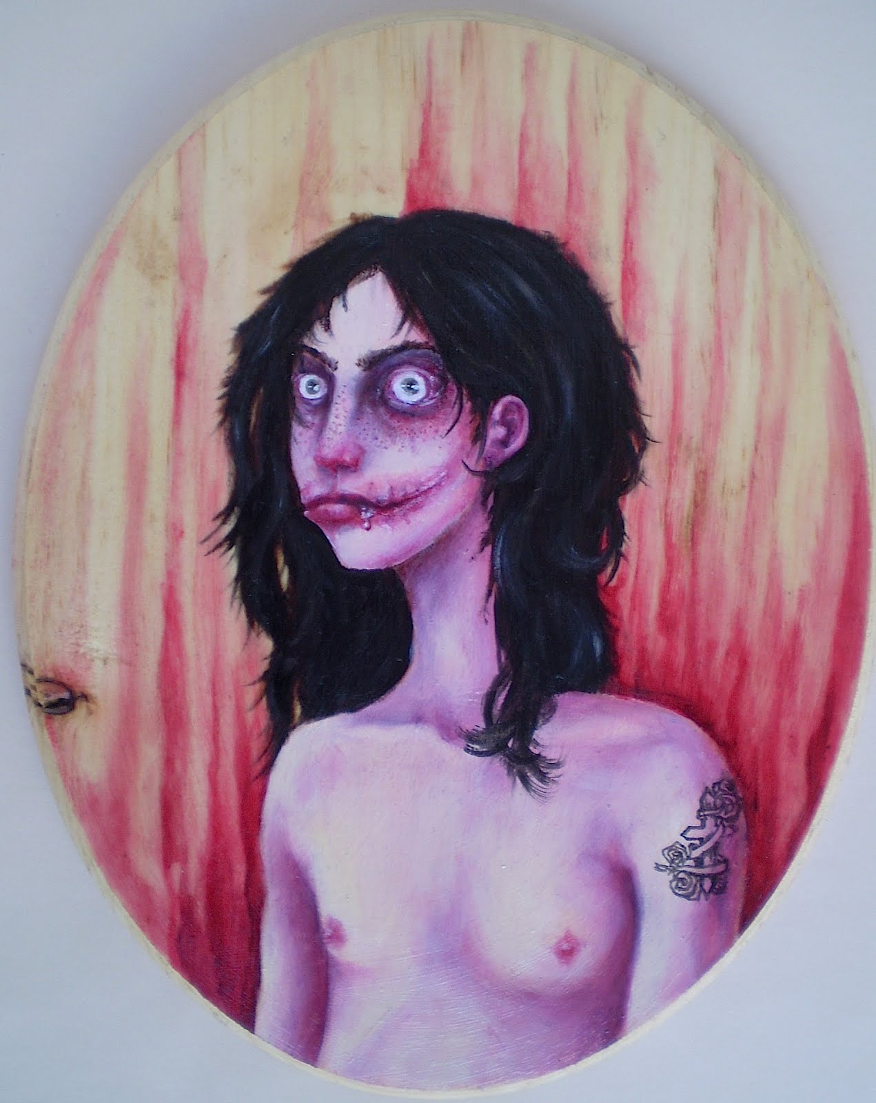
Okay, so here's (probably) the last and most intricate piece I'll be displaying that has to do with Jeff the Killer. After viewing thousands of images of him and his supposed likeness on sites like deviantART, I found myself becoming irritated with many of the images because they seemed totally unrealistic, and I think I'm a hardcore realist at heart. So I decided, as I usually do when something pisses me off artistically, to take matters into my own hands.

This is the result. I first started off thinking about what would happen, after some time, to someone's face after they'd given themselves a Chelsea grin, and figured there would be a lot of scar tissue involved, as well as a considerable amount of regrowth. With a portion of the cheeks open past the natural boundaries of the mouth, someone like Jeff would also probably have something of a drooling problem. Ew. The eyes, of course, which are often portrayed as ringed in soot (the eyelids were, according to the Pasta, burned off with a lighter, though I still think that would cause irreparable damage to the eyeball itself), though after time they would only be surrounded by more scar tissue. I've seriously never thought about facial mutilation quite this much before.

The face itself is modeled after my own. One of the reasons why I like this character so much is because one of the core themes of his story is the concept of beauty, of finding one's own definition of beauty against societal odds, and relentlessly pursuing that idea. Thanks to my own body modifications, I've experienced the OH MY GOD WHAT DID YOU DO TO YOURSELF quite a number of times. It's hard to explain to someone who has a very fixed idea of what is and is not beautiful you idea of beauty, that beauty is subjective, not objective, and that one idea of beauty is no more or less valid than another. I also know how it is to feel as though the physicality you have is a liability, and how it feels to want to confront peoples' shitty and exploitative concepts of (female) beauty in an aggressive manner. There was one time, a long time ago now, when I had a passing fantasy about cutting my face open like that. I really did--I even wrote about it when I used to keep a journal. I'm not proud of it, but it's true. Nothing ever came of it because I have better self-control than that, but it's still part of my history.

If you don't know, a very distilled version of the Jeff story is that Jeff mutilated his own face and subsequently thought of himself as beautiful. This concept of challenging the commonly-held ideas of beauty, of forcing people to look at something they've been trained to see as ugly as something beautiful is interesting to me, because I do believe that the truly beautiful things are the things that make you think and feel deeply--and often, the truly beautiful things are going to make you uncomfortable, make you afraid, and make you hurt. You don't escape from real beauty unscathed. As I've said before, when it comes to creating art, I find it much more fulfilling for everyone to create something that is uncomfortable but stirring than pleasant but superficial. Beauty and terror and ugliness and transcendence, to me, are all wrapped up in another as facets of the human experience.

I also should tell you that I am way over-analytical and make a big philosophical deal out of things like Creepypastas.

And because of all that, Jeff looks something like me, with big lips, freckles, unkempt black hair, and dark circles under the eyes. I gave him light eyes, though, as it fit better with the original image. He's also got a tattoo for some reason, I couldn't tell you why, but I think it stemmed from needing something dark at the base of the image to balance out the hair.

From a technical standpoint, this is the first time I've used gloss medium (clear) on wood, which allowed me to work with the natural forms of the wood, which was nice. Besides, wood knots, like the one seen here, have a way of insinuating itself through many layers of paint, and so I figured I would work with it rather than fight it. I chose a pink scheme because it seemed natural, plus I really like what pink glazes do for skin tones. Because of the pink and the sort of low-brow inspiration for this piece, it's being categorized in the Trash body.


Today I bought another one of these wooden ovals so that Jeff can have a companion.

Sunday, March 25, 2012

of wolves and foxes


I had some trouble classifying this painting (and I do so love to classify), because its attributes fall into both the Home and the Medieval categories of my painting. It's on fabric, and features the painting style that I usually use for the Home pictures, but the clothing and composition, as well as the inspiration, are more in keeping with the Medieval style.

The title, Ai Vis Lo Lop, is Old Provencal and translates to "I saw the wolf." It's also the title of a song, which was the inspiration for this piece. Here are the wolf and the fox, meeting under the tree. There's also a rabbit mentioned in the song, but I think they ate it. Fun fact: the term "seeing the wolf" was also a slang term for losing one's virginity. So take that as you will.

I had a lot of fun painting this one, and I'm very happy with how the faces came out in particular, and I tried to keep them as close to the sketch as possible. I really like using pink in faces. That's me on the left as a little black fox, and Beastie on the right as a gray wolf. This was also the first time since I was about six that I've drawn anybody with animal ears, and I was a bit apprehensive about it, especially after seeing all the furry/anthro/neko-neko-kawaii bullshit the Internet has to offer. I like them, though, and I was thinking of it in terms more of medieval-style pageantry than literal anthropomorphism.

Friday, March 9, 2012

tales from the sketchpad, part 6


The time has come to end the sketchpad series. It's sad, I know, but my poor pens are suffering from exhaustion and quite frankly, I'm tired of the sketchpad. Like, really tired.

So here are the last two pages of the sketchpad. My .01 pen was fading fast, so as you can see, I resorted to using a .08 for the backgrounds of both of these. I don't like the heavier line quite as much as I do building up layers of finer lines, but it's passable.

Up top we have another Jeff. Seriously I am the sickest fangirl for him, because I have a thing for long-haired guys with crazy eyes, toothy smiles and big knives. I don't know what that says about me, exactly, but I'm okay with it. He's seen here after a long and productive night cleaning his knife off. Pasta-monsters have a pass when it comes to blood-borne diseases. Jeff's .08 background actually came from necessity, as there was some Prismacolor marker bleed-though from the other side of his page that had to be covered. And you always have to cover up the bleed-through, right Jeff?

Next is a portrait of me and Beasty. I'm not 100% thrilled with this one, but I wanted a picture of the two of us and here it is. I struggled with this for a long time, going through about a thousand pencil versions--the remnants of which you can still make out in the white areas of the image--before settling on this one. I was originally going for something a little sexier, but it never quite worked the way I wanted.

I salute you, Sketchpad. You will be missed. Kind of.

Sunday, June 19, 2011

tales from the sketchpad, part 1


My mom gave me a sketchpad a while ago. I don't typically use sketchpads, or anything spiral bound. I'm very particular about my sketchbooks, but I started carrying it around anyway, in addition to my regular sketchbook. I decided it would be a good place to draw the stuff that I don't like to draw in my regular sketchbook, namely pen drawings. My regular sketchbook is generally used to try out new painting ideas, and I don't like to use pen in it. So the sketchpad became the place for pen.

Here are some samples of the pen stuff I've been doing. I'm not entirely satisfied with them, as pens have never been my preferred medium. I think they're a little cartoonish, and that's not a style I particularly like (even less so after everyone in high school insisted that cartoons were what I "should" create). Most of these images are drawn fairly quickly, and represent pretty uncomplicated ideas.

At the top is a form of skullhead. She's a grown-up skullhead, and kind of south-of-the-border-themed. There's not much to say about her.

Then comes a self-portrait. Yes, that's me. I consider all of my work to be self-portraits, in that they express interior feelings or processes of mine, which, to me, is a self-portrait of the most intimate kind. So it's weird to do an "actual" one, of a physical representation. And anyway, I don't feel that my physicality is terribly interesting. But I like this picture.

Then comes Spider Mouse. I had a dream about Spider Mouse one night and it was just the cutest little thing, crawling up the wall and being all fuzzy. I tend to dream about really fucked-up animals a lot, but they (the animals) are usually really friendly and cute. Recently, I dreamt about a small furry horse who lost two legs to a bear attack and lived in this family's front yard and ate cereal.

I really want a Spider Mouse.