Showing posts with label watercolors and drawings. Show all posts

Sunday, December 21, 2014

after a good long while

 Well, I've certainly abandoned this blog for quite some time. The last six months have seen some major transition, including me getting a new job (hooray!) and basically being an adult. I also got to hang my first NYC show, and also my first show since moving. It's been a pretty good six months, actually, especially in the job department. As a result, I've been sort of viewing my life in the past year-and-a-half or so in terms of When The Old Job Was Good, When The Old Job Sucked, and The New Job. These were painted in the middle period, probably in the spring and summer of 2014, all in the second of the two spiral bound notebooks I used to haul around to occupy myself and mitigate anxiety. 

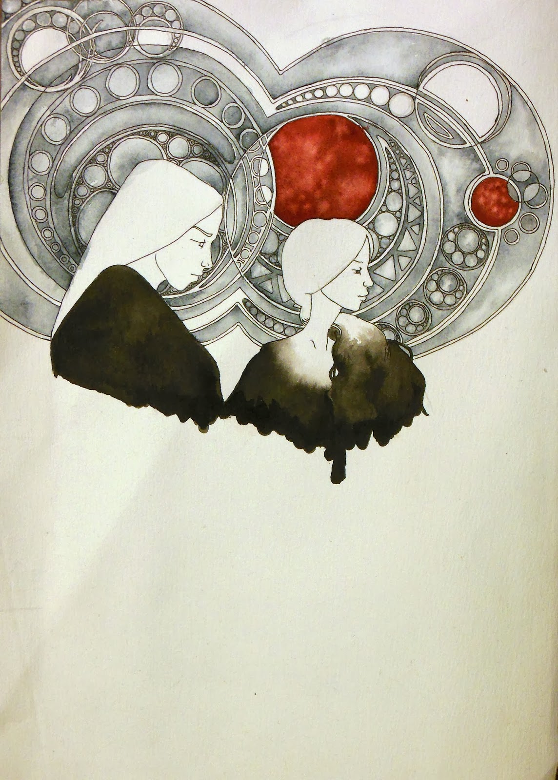
First up we have two WelcomeTo Night Vale pieces. The top on is Each Named Erika (with a K), in reference to the angels. Canonically, they have non-human, oblong heads and are sexless, but I decided to model then after people I know (including my favorite model), who are sexed and have less-than-oblong heads. I also gave them some floating planetary symbols and multiple eyes. This is the only one of the WTNV pieces I've done that doesn't incorporate text. 

Next we have Intern Dana, another Night Vale character as she goes on her somewhat spiritual journey through the desert on the other side of the door, encountering a mountain and growing exponentially to become mayor material. To be honest I have fallen out of listening to Night Vale and I'm some months behind. The new job is less conducive to podcast listening, so I've been slacking off in all podcasts. A lot of the WTNV fan art I've done (as well a lot of other art) features triangles pretty heavily. Because I really like triangles. 


Following that is one of the few horizontal pieces from the notebooks, called Closer to the Moon, based off night vistas from home and that feeling when the moon seems surprisingly close. 


Perch was a spring piece, getting back into the mint greens and quaintness. It's, um. It's a big bird. I don't know, this was kind of just a spur-of-the-moment thing. This was during a pretty depressing moment of When The Old Job Sucked (like, more so than usual), and I might have been trying to make myself feel better. 
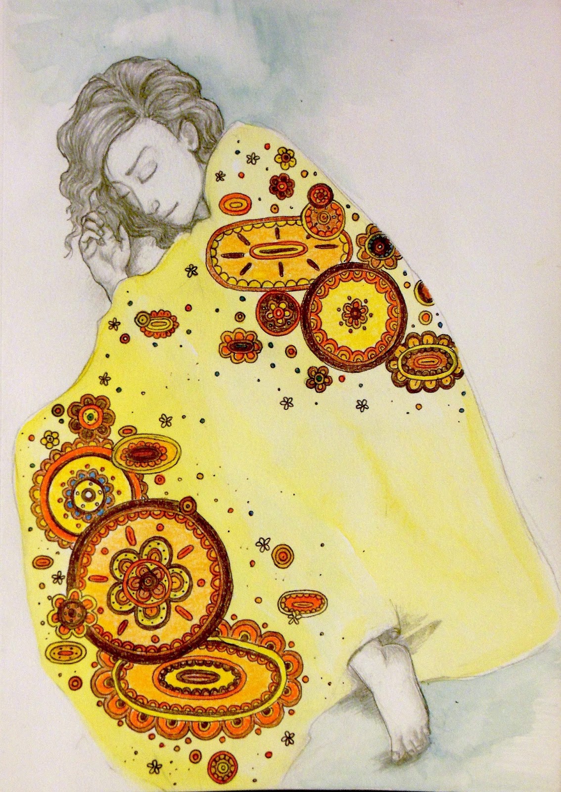
 Sensitive kind of came out of the same thing. If I remember correctly, this one was started sometime in the late winter, but kind of abandoned for a while.  While everything else in this selection is a watercolor/ink/gouache mix (except for Closer to the Moon, which is acrylic), this is pencil. 
 Here we have The Editors, with a throwback to the the massive black blob bodies of the medieval tradition. The name came from a work reference, actually (old job), and I sort of posed them as a mysterious, esoteric council. The tallest figure is modeled after someone who was not, actually, an editor and who has managed to sneak into a few other pieces, including possibly as the central figure in Each Named Erika
And lastly we have Camp of Hearts. This was another one that took a long time to materialize, and I actually had the title before I had the actual image. That's not uncommon in my personal process. I think the title came from misreading something that actually said "camp of the arts," as in a summer camp with art programs, but my strange brain turned it into something else. That also happened with What Double Vein, where I misread "what do you believe in." This not only came from the misreading, but I think was also inspired by movies like Moonrise Kingdom and a camping trip to Ithaca. I wanted something genuinely wholesome and classic, with a warm, nostalgic sense. 

There are actually considerably more art pieces I'd like to include here--I've been surprisingly prolific, even if it's only with small things. Currently I've been waging war on/avoiding Christmas, but hopefully over the holidays I'll be able to do some larger-scale pieces. 
Hooray!

Friday, April 4, 2014

geometry & girls, forests & fog, rabbit eaters & kings.


The thing I like about the notebook I've been using is that it allows me to quickly fire off smaller-scale projects. In the past, many ideas were relegated to a pencil-only sketchbook and never really got to evolve, or they were made into watercolors and then lost in the morass that is my art file in my desk. The notebook, though, allows me to keep everything in one place as well as create full paintings. All of these come from the same notebook. And it's spiral bound! That is a really, really big step for me. One of the things I was doing was collecting words and phrases I found interesting and creating images to go along with them. (Note: everything here is 7 in by 10 in, for size scale)


From the top: 
A Million Girls. I think the line might be from a Raveonettes song. It's water color and ink.  It was also featured in Inconnu Magazine's "All Things Roll In."

Rare Geometry. Watercolor, ink and acrylic. The name came from an article (that I sadly can't find now) on the structure of the universe, and this phrase really stood out to me. Also, interference paint. 


The High King. Acrylic, watercolor and gouache. This is actually the second incarnation of this title; the first is still in the works. The title originally came from the Disparition song of the same name. The first one matches the music a little better, but I still like this version as well. 


Rabbit Eaters III. Watercolor and goauche. I completely love these little guys. I have this whole little story about them in my head, where they are small, naked people who live in the woods and eat rabbits, and have white eyes and red hands and arms, and they like to wear twigs in their hair. The latter might just be rabbit blood, I don't know. But they're really cute. 


Interior Forest. Watercolor. It had been a long time since I did some weird ribcage stuff, so here you go. It's also rare that I ever make a female figure with light hair (that isn't me as a kid). There isn't, I suppose, much to say about this one, though I am working on a sister ribcage girl. 


It Came from the Bathtub. Watercolor and ink. I bought green gel pens just to make those little algae guys. I work very near an art supply store and resisting things like interesting pens and tiny notebooks is really, really hard. Anyway, this is a self-portrait! I thought of it while taking a bath. I normally don't take baths because sitting in bathwater grosses me out, but I was in need of some girl time so I was hanging out reading magazines and listening to Hole when I noticed that the bathwater was green. Not gross green--it was kind of pretty and interesting. 


Self Portrait in the Fog. Watercolor, ink, gouache and acrylic. Naturally there needed to be triangles somewhere. Here I am at the end of winter, in my plaid coat and my awesome boots and my general feeling of absurdity. 


Friday, January 31, 2014

demonology 101 and night vale


Okay! So I recently purchased a 7 X 10 inch notebook for watercolor projects. (It's spiral bound, which is a big deal for me because I typically hate those.) I wanted something for small projects and experimentation without having to use large or expensive pieces of paper. I also like that all the projects are in one place, both for practical ease and for reflective purposes. I have a few things going.

Above are portraits of two of the demons from the Ars Goetia, which is a list of all the demons of hell and frankly, they sound just adorable. Beleth is on the left, and he's known for looking scary and writing a book of mathematics (seriously). Naturally, he's modeled after Beastie. Paimon is on the right, and he's fancy. He just is. These were a lot of fun to do, because I had free range imagining them and their outfits, and how those would relate to their personalities. I did choose the more human-looking ones for this project. The curly symbols on Paimon's chest and Beleth's collar are their sigils--every demon gets one and you summon them by drawing the sigils and maybe saying some kind of recitation. So if I suddenly get fancy and my math skills improve, you'll know why. There are two more in the works right now. 


Here are some other projects I've been working on! This is some fan art for the podcast Welcome to Night Vale, which I listen to at work so that I can have an even more surreal time there. Seriously, it's great, and its utter lack of visuals makes it perfect fodder for art, since you can create the world completely in your own head, plus the writing is beautiful, as is the score. On the left is Erika, an angel who contributed to poetry week. She may have been conflated with one of the hooded figures, hence the hood, but that was the idea I had for her and I'm happy with it. On the right is Tamika Flynn, leader of the childrens' resistance against StrexCorp and slayer of librarians. I apologize if this all sounds rather esoteric, but that's really all I can give you. Both of these, like the demons, were fun to do because I had no visual reference other than some cursory descriptions, so everything was completely up to me. With Erika and Tamika, I tried to capture the feel of the characters as well as the feeling of the show itself. The text pieces are lines attributed to these characters, and selecting the style was also important in their portrayal. 

More sketchbook projects and inconnu illustrations coming soon. I've been carrying this thing around with me to work and taking 15-minute drawing breaks to keep myself from breaking down and crying all over my boss (again). It's also nice because I can jump back and forth from project to project easily without having ten million separate pieces of paper everywhere. Hooray for sketchbooks!


Thursday, October 3, 2013

explorations in limited palettes and fan mail

 Well, hello!

This is what working all the time and taking a class and trying to have a social life does to you. That, and the lack of sustained attention that unfortunately comes with the Internet. 

Here are some new(ish) things! The first three explore a limited color palette, using ink and a bit of watercolor. At the top we have a forest spirit of sorts, and evolution of Beastie. Lately I've been liking headdresses, and his has typically been the bones of small animals. He's also been clearly affected by the aesthetics of Sword & Sworcery, with his trigon. This was done using India ink, red watercolor and some black gel pen for the details. 


Below is a painting using much of the same materials, although I think there's some Payne's gray in there in addition to the red. The circles are vaguely Mucha-esque, and were created using a compass. The figures are a take on the medieval figures with their big black robes. 


Next is something I thought of while listening to Grimes' "Visiting Statue" off the (perhaps aptly named) album Visions. I actually had a whole music video mapped out, but as I lack the funding and the willing victims participants to make music videos, I had to make due with a still image. The challenge of this one was to lend a thick, opaque, sculptural look using water media, as well as working on a gray ground. I started by coating a piece of (white) paper with a mixture of white gouache and Payne's gray watercolor, and layering more of that mixture until I got a good ground. Then I painted in the figures and the landscape, and finished with a mixture of white gouache and yellow watercolor for the constellations and circle shapes. I also emailed a copy to Grimes' fan mail, just for fun. 


Finally, we have a painting with a more traditional palette. This came from the idea of the Manitou, an Algonquin concept of an innate spirit present in all things, including people, animals, plants, rocks and even machines. Specifically, it's a reference to Manitoulin Island in Lake Huron off the coast of Ontario, which means "spirit island." The image is just something that sort of popped into my head, of a big sleepy creature-island supporting lots of nature and people. It looks a bit sad, but it's really just sleepy. I'm really happy with this one, and I'd like to find a nice frame for it. 


Sunday, July 28, 2013

illustrations at inconnu

So, wow, it's been a while. Things are fine. I've been doing more illustrations for inconnu! Here are some of them.

From the top, we have an illustration for a break-up playlist,  one for a piece on horoscopes and other pseudosciences, one for the magazine's "Hamlet week" of Hamlet being a creep (because I think he's a creep I don't care about his melancholy), and finally an illustration for a piece on digital aesthetics.

And look, circles! Circular compositions that actually work! Crazy! Although I maintain that circular pieces work best when small (these are no more than about 4 inches in diameter).

The Hamlet one was a lot of fun to do. I really enjoyed working on the faces. Because it depicts the play scene, I had to work out how to make it clear that the actors are, in fact, acting. So the sleeping king had be be a sleeping king but also a very conscious actor playing the part of a sleeping king. The false beard was fun, too. It also made me think about Hamlet as a play and Hamlet as a character. Like, what if the plot against his father was actually because his father was a bad ruler and bad husband, and his mother and uncle were actually in love, and his uncle was a better ruler? And then Hamlet, in his blind devotion to his father, ruins the rule of Denmark and ultimately paves the way for Denmark to fall under Norwegian rule. What if everything was actually going fine and then  HAMLET RUINED EVERYTHING? 

You'll have to forgive me. It's been a while since I've been able to discuss literature. Regarding the art, though, Hamlet seems to be an evolution of the blond-haired men in the "medieval" body of work. 

The last one is actually the original draft of an illustration. In the accompanying article, it has an iPhone text background, so the final result was something of a collaboration between me and the editor. Also there are cupcakes--everyone likes looking at cupcakes and using them as a desktop or as decoration on digital devices is not uncommon. Who doesn't feel better looking at cupcakes?

All of these were created using varying combinations of watercolor, gouache, acrylic, ink, and gel pen. Gel pens are severely underrated.

Monday, April 22, 2013

triangles, occultism and water media


I've been listening to a lot of witch house, can you tell?

Here's some of the watercolor stuff I've been doing. I've lately been very into triangles, as I may have mentioned before. They started showing up on the throats of my figures, and I like how it looks, so we'll be seeing more of it. I've also been into occult symbols and the like. I've worked with them minorly before, but I really like what they add to an image--something like esoteric writing--and so I'll be using more of those, too. 

From the top:

Priestess is the earliest piece here. She's pretty simple, done in watercolor, India ink and gouache. Her design was based on a combination of occultism and '70s-ish graphic/fantasy illustration, which used a lot of solid areas of color for a look that's simple and linear so it's at once streamlined and modern while still evoking traditional fantasy. So that's what she is

The Universe is a double portrait, and done in a more detailed, traditional style. This was made using the usual mix of water media as well as some acrylic paints, which were watered down to the point of behaving like watercolors. I also used some interference paints, which add some nice iridescent detailsI had a lot of fun making this one. The sky was made my wetting the paper and basically letting the paint go wherever (not too much, though. I'm too much of a control freak for total abandon) and then forming cloud/nebula shapes by shading and highlighting the resulting forms. The costuming was probably the most fun. I used to draw costumes all the time--when I was a kid I would have reams of paper with these bizarre fashion innovations on them--and then somewhere in college I started painting nudes because SERIOUS ART or something. But there's so much you can do with clothing. From a conceptual standpoint, it adds to the characterization of figures. From a technical standpoint, it's a great way to practice a lot of textures. Here, I got to play with sheer fabric and fur, as well as metallic surfaces for the accents. Oh, and that's a dodecahedron on his brooch thing there. Hooray for Platonic solids!

Finally we have, um, this guy. Drawing a scantily clad man with a come-hither expression and a big fucking gun just sort of made sense one day, so here he is. This has more acrylic in it than The Universe, specifically the fluorescent colors that like to cause retinal damage but are fun anyway. I don't know where this came from, to be honest. I just wanted to do something uncomfortable on several levels. A friend came over and said that this picture "creeped him out." I said that if it creeped him out, then I did my job right. 


Friday, April 12, 2013

water media madness

 I was terribly, and pleasantly, surprised to find that THIS is what it looks like when you use water media on fabric. I had tried it before with some small pieces, but it works really well on a larger scale, too, and can be built up to a decent opacity. 

I was originally going to hang these on our closet doors at home, kind of a his'n'hers sort of thing, but the doors seem to be made of diamond and cannot be pierced by the pointy things of man. So they live on my desk. 

Up top is some beast boy creepiness, complete with blood and pointy claw fingers. And a hair bow. I used Mod Podge to seal the fabric on this one, and I'm not sure if it was that or if it was just not stretched properly, and so the fabric buckled slightly. It didn't effect the outcome, really, but was not as pleasant to paint on. This is primarily gouache, tinted with watercolor.

Below is some fashionable witchiness. This one was created using gouache and watercolor as well as India ink, acrylic paint and gel pen. REMEMBER GEL PENS??? I bought some bright pink gel pens a while ago on a whim because they transported me back to seventh grade, where the cool thing to do was to scrawl all over yourself and your friends with smeary opaque ink. They made the finer pink branches near the bottom, and were fun to use. 

So, they're not oils. Nothing is oils. But they were fun to make, and I got to play with lots of interesting ways to combine colors and materials. The only thing about this, which I discovered the last time I tried this, was that because of the primed surface, the paints will wipe right off if they get wet, so I might want to spray seal these sometime. Although, during the painting process, this feature actually came in handy as it served as an "eraser" of sorts. 

I really like bright pink and I need to use more of it. I've also found I really like designing costumes and painting fantastical clothing, and will be continuing this trend.

Friday, March 1, 2013

them

I actually drew this quite some time ago, late one night while listening to this, when these four paid a visit. They seemed friendly enough, if not very talkative. They have, from left to right, deer, owl, crow and rabbit skulls, and I always thought of them as friendly guardians of some other plain of existence

This is just pencil in my sketchbook, which I'm afraid is getting rather filled up. 

Saturday, February 9, 2013

mini paintings for mini spaces

 So I moved! But that means that I have neither the space nor the ventilation to make oil paintings. It would be nice to be able to do larger-scale oils, but I can always take the train back up to Mom's and work if I feel so inclined. In the meantime, I can work on tiny little guys like these.

These are created using watercolor and gouache, which works out beautifully on the fabric. The fabric is mounted onto little embroidery hoops that I found at a craft store (SO much cheaper and cuter than round canvas stretchers). The ovals are 5 X 3.5 inches, and the circles have a 3 inch diameter. 

So very tiny. 

The ovals feature some kind of slightly mutated hoodie, now a bit frillier and more overtly feminine, and a mysterious wooded area. Maybe this is my subconscious interpretation of moving and going into the unknown. 

The circles were a little trickier (you know how I feel about circles), and I was originally going to stick with the hoodie theme, but I went for animals instead. Owls and rabbits are some of my favorites, so here they are. 

 
That owl looks kind of confused, doesn't it?

Anyway, I don't normally paint or draw animals on their own, but these were fun. These pieces are mainly meant to be decorative, and I was mainly concentrating on making something cute that I would continue to enjoy looking at, and their small size means I can put them in weird little corners. 

The only issue? They need to have some kind of sealant, preferably a spray sealant, to protect the paint.  


Monday, January 21, 2013

remembrances

So, I didn't mention this because I don't like posting very personal things on the Interwebz, but my dog died in August. It was really hard on my mom and me. I didn't really want to talk about it with anyone. 

But I made my mom this picture of Calypso for Christmas, with her big pink belly and her knobbly feel and big giant eyeballs. I was going to depict her engaged in an activity, but Calypso's favorite activities were killing rabbits and rolling in shit, so I went for a more traditional portrait. 

Here she is.  

Sunday, December 9, 2012

endings, beginnings, and such

 It liiives!

This blog, I mean, as well as my art-making. It's been going well, I guess. I had two gallery shows in the past two months, and have contacted another one regarding showing (haven't heard back, though). I've been working on two new paintings and am probably going to set up for a third, which will be nice and bloody. Yay!

In the meantime, have the first and second installments of a small illustrated story I've been working on. I'm calling it The End or the Beginning, because that's what it's about. 

See, I don't normally use art as a means to directly express things going on in my personal life. My personal life affects my art, of course, but I'm not usually prone to illustrating it literally. This series, however, is close to doing that. Obviously it's not literal literal (I don't know people who habitually wear burlap sacks on their heads), but this series is about something I went through over the summer, which was both an ending and a beginning for me. It also corresponds to some writing I did about that issue, and some of these images are direct illustrations of those writings. 

Again, I don't make comics, and this is probably the closest I can comfortably get to making something akin to a comic (Duck vs. Cactus notwithstanding). On a technical note, I'd like to bind these, but they're all on separate pieces of paper, and I'll have to finagle something.