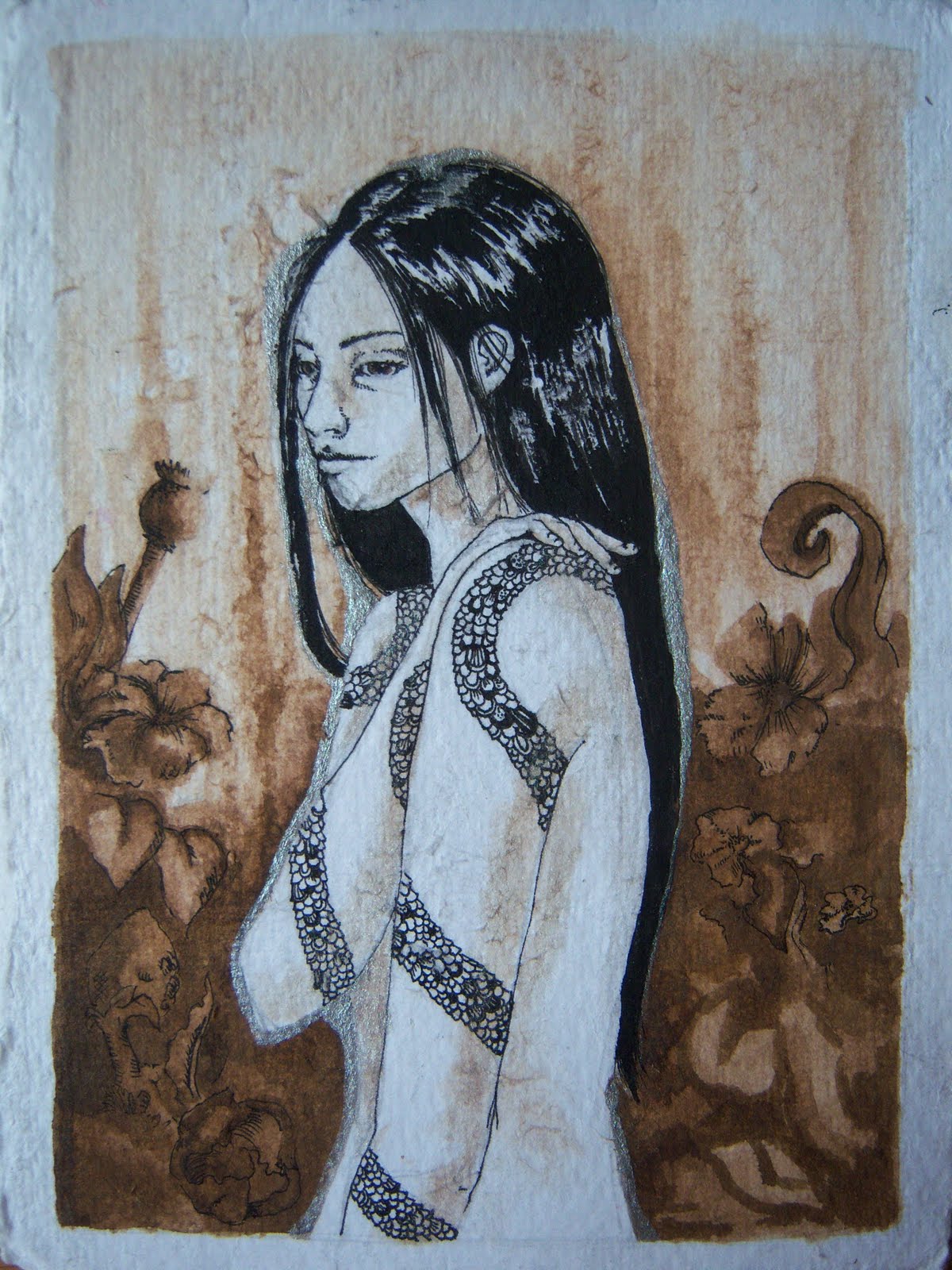
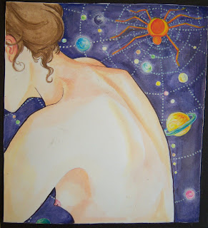
 I feel not-quite-great about uploading all these older, smaller works. I want to show off some more awesome large oils, but I've been rather remiss about, um, actually doing the awesome large oil paintings. For one thing, it's been really damp here--the remnants of a tropical storm moving up the coast--and nothing, NOTHING, is drying. There's only so much underpainting one can do. Plus, the basement is dank and unappealing in weather like this.
So here are some watercolors I did a while back. They are all portraits of the same person, taken from memory. Top to bottom: Shiva Reclining, Sugarbear and Spiderverse. All are watercolor, ink and gouache, and the top one has collage elements, taken from magazines. The top and bottom pieces are kind of companions--both are mounted (hastily) on black cardboard and are the same size. Sugarbear is my favorite for mushy reasons; our dear subject walked into our bedroom one afternoon and greeted me in such a manner. The others were more experimental in terms of concept and material, and I'm pleased enough with how they came out.
These were kind of done in a spur-of-the-moment fashion, so I'm afraid there is very little concept or backstory to explain in these, other than that they are visual celebrations of someone very special to me. I tend to be less careful, in a way, when it comes to water media, basically because I can afford it. Oil paints and products are, let's face it, really freaking expensive.
I was thinking of collecting all the small works I've done over the years into some kind of book or something, since right now they're all floating around my room in and subject to violent death and demise and that would really be a shame.
More oils soon. Really.


 Happy Autumn! I never made much jewelry because you have to buy all those little bits. Or, you have to have a bunch of potentially fire-starting tools and chemicals at your disposal and I don't. Usually, it takes a formal environment to kickstart the process of doing something you don't normally do, which is why I don't do all the things I always say I want to learn how to do, like knit or do yoga or some kind of martial art or fly on the trapeze or ride horses or scuba dive or...you get the idea.
So here is some jewelry I've made and even occasionally wear, when I have time to remember things like jewelry and am not in a mad dash to catch a train or something. All are fairly large (for jewelry). I took a class on non-metal jewelry which taught me the basics of handling all those little bits.
The top piece is a pendant based on the paisley design. It's stained wood, hand-carved with a flex-shaft (WANT) and set with glass beads (and by "set" I mean, "they're glued in"). Note jump ring fail at the top--I added that after my access to proper jewelry making equipment had ended. But I actually really like this one, and out of the three, I wear it the most often.
Next is a large brooch, about 2" X 2" square. It's an antique photograph, ca. 1850s-60s. A miniature scanned version of this (two of them, actually), can be seen in The Homestead, along with figures from some of the other photos that came with this one. This is the original. I think she looks kind of like Kirsten Dunst. I constructed the brooch myself, using bookboard for the back and painted balsa wood strips for the frame. The photograph and dried flowers are protected by a piece of plastic from a picture frame. (I'd rather glass, and I even have a glass cutter, but I don't have any glass around.) The findings themselves are store-bought, and everything is held together with bookbinding glue.
Lastly is another piece I made in the jewelry class. It's a brooch, and is my one great attempt at metalwork. The back is, I mean. It's pretty clumsy, but I'm personally happy with it. The making of an actual pin is a complicated process that I won't get into right now, but let's just say it functions correctly. The back is dyed leather with burnt-in paisley detail (I had a theme going) mounted on wood. The figures are scrimshawed rawhide (scrimshaw is traditionally done on bone or ivory, but can be done on just about anything, including rawhide, though the ink blurs a little), the frame is carved wood, and the pearls are real. Interestingly, the two girls here are reminiscent of the character sketches I mentioned in the last post. The piece was meant to evoke an old family photograph, something to do with memories of childhood.
So sometimes when I get bored or when I'm watching TV or when I'm bored watching TV I make jewelry. Admittedly, I'm not very good at it, but I rather do enjoy manipulating minutiae, and my style appears to be somewhat Victorian, which I never really realized until now. I also seem to go about jewelry making like a painter--note all those framed images. I don't think I'll be posting anymore jewelry, though. This was something of an experiment, I guess. On to more paintings!

 It was a windy day in New Paltz, New York, and I was wearing a muumuu. It's a rather nice muumuu, vintage Hawaiian, bright red, that I bought for $45 from a lovely lady named Shabbat who plays guitar and sells homemade and vintage clothes. Anyway, it was a windy day and we all know nothing picks up wind quite as well as a muumuu. And thus the Tumblies were born. There's really very little concept behind the Tumblies outside of cuteness--they're small, lightweight girls in large dresses who drift through the air in a variety of themes. They're very straightforward, universally accessible. My mother tells me I should
 market them to Hallmark, and I just might. The top three images are some examples of them--the ones I like best, anyway. They are, top to bottom, Aeronautic Tumblies (note the protective eyewear), Tumblies of Summer, and Pollen Tumblies. Like I said, their main concept is being adorable, since I can't be expected to plumb the dark oceans of emotion all the time. Sometimes I just need some cute. These Tumblies are created using watercolor, ink and colored pencil on paper.
Below the Tumblies are two pieces that speak, in a way, to  my other interest, which is writing. Generally, I don't mix my writing and my art. They come from very different areas of myself and I find it ultimately detrimental to both disciplines to mix them. Maybe it's vanity--I like my art to be able to communicate without words, and my writing to be able to communicate without images. Graphic novels and comics, in case you were wondering, bore me to tears from the standpoint of a creator, though illustration doesn't repel me quite so much. The second picture from the bottom is a rare exception (one of them, anyway). She is a character from a story I once started to write, and have put on the back burner for the time being. Her name is Mary, and her tattoo is a snake that wraps around both arms and over her shoulders. The one overlap I have is a habit of sketching characters. Something about seeing them physically as I see them in my head is helpful. There are two other, similar images from this story showing other characters, but Mary remains my favorite. It's India and acrylic ink and pen on paper, the same smallish (about 3" X 5" ish) paper the Tumblies are on. I'm really bad at identifying paper types, you'll have to forgive me.
Below Mary is a rather strange image--even for me--that occurred one evening seemingly out of nowhere. The day, I recall, had been filled with rather sordid activity as befits college kids in an empty summer house, so maybe that has something to do with its origin. The result, anyway, were those wonderfully ugly children all stained with mulberry juice--or possibly something more gruesome. Mullberry juice does make one look rather like the undead if one gets it all over one's face. This image, unlike Mary, has no greater narrative, but is one of the rare images in which I've used text. I don't generally. For me it's too rigid and, like I said before, I like my art to not need the addition of text to make its meaning or even feeling clear. But there's always an exception. Here's one of them, watercolor and pen on Bristol plate (I remember that, because it's in big letters on the pad), 8.5" X 11".
I'm getting better at water media, and there's something nice about it. For one thing, unlike oils, water media is nontoxic and can be used in the comfort of your living space, which is a nice break from standing in the basement. They're also easily portable and easily prepared and cleaned up. My watercolor, ink, and gouache palette is a piece of aluminum foil, for example, and all the paint tubes can fit into the relish jar I use for water. With the exception of We Were Eating Mullberries, all the images here were created during the month I was living on my good friend Jillian's futon. I had no permanent studio space at the time, and obviously I couldn't use (toxic) oils in her apartment, so my only outlet, artistically, was water media. So if you're ever camped out in someone's living room for a period of time, bring your watercolors.


 If you look to the right hand side of this blog, you'll see a quip about cupcakes in the "About Me" section. It's true. I do find cupcakes, and all gooey baked goods, for that matter, to be somewhat sinister. I don't know why. Something about all that prettiness and sweetness...you just know it has to have a dark side.
I made these paintings a few years ago, when I was tired of using the darker, more jewel-like tones of the medieval-style paintings and wanted to do something a little brighter. I was also interested in the idea, especially after working with ideas informed by sacred art, of the line between high and low culture.
So I went out and bought some glitter.
Because glitter, many believe, has no place in good, grown-up art. It's for kids. But I say not so. First of all, I don't use just any old glitter. I use Martha Stewart brand glitter, which is seriously the highest-quality glitter I have ever seen, and comes in a wide variety of colors not generally associated with glitter (olive green and brown, for instance). I also bought Martha Stewart brand cupcake wrappers, some of which were collaged onto this painting and some of which were used to make actual cupcakes. Martha has a section dedicated to her wares in craft stores like A.C. Moore and Michael's, and a good time can be spent there pondering over how anyone could come up with this stuff. Say what you will about Martha, she knows how to make fancy, useless, amazing crap like a pro.
These paintings are the first in which glitter is used. For these, I mixed the glitter with neo megilp, which I had been using for the rest of the glazes, to create a glitter paint. The glitter use, compared to what I've been doing lately, is modest, and even hard to see in these pictures (it's mainly on the wall behind the figures, accenting the designs there). I've also found that I prefer using it with stand oil--because stand oil makes everything better. They are also the beginning of what I've been informally calling the "Trash" line, which uses a lot of pink and glitter and really bad taste as a way to explore the ideas of what taste is, what is acceptable as far as art is concerned, and what kinds of implications arise by using childish (and typically feminine) colors and symbols and calling it art.
The Cupcake Diptych is unfortunately quite delicate. Besides the collaged cupcake papers, there's a brittle batch of gesso underneath which requires they be kept in a safe place (like, not my closet). I'm not, looking back on them, quite satisfied with them as far as the modeling goes, but I can appreciate them, at least. More Trash coming soon!
 I actually disco
 vered Kara Walker in an old issue of Oprah magazine--someone
  had left it at my job and it says something about how dull my job can get when I am reduced to reading Oprah's publication. My consolation, I suppose, was learning about the work of Kara Walker, who creates vast cut-paper installations dealing with themes of race, sexuality and identity. She also employs shadow, performance and video into her work.
Walker was born in Stockton, CA, in 1969, and her family moved to the South when she was in her early teens. She received her BFA from Atlanta College of Art and her MFA from the Rhode Island School of Design. It was during her graduate studies, in 1993, that she began working with the silhouette, which is tied to her contemplations of identity, race (and racism), as well as a look back to the portrait-making process of centuries past, when only the very wealthy could afford oil portraits. The lower classes made do with silhouette portraits, which at once portrayed and obscured the sitter. (On a somewhat related note, they used to make us replicate this practice in elementary school during studies of the colonial period. We all totally hated it.) She says of the silhouette, in an interview with PBS, "The silhouette lends itself to avoidance of the subject. Of not being able to look at it directly, yet there it is, all the time, staring you in the face."
Walker's work is rather startling, to put it mildly. Her depictions of African and African-American people, for example, are often uncomfortable to look at; Walker bluntly identifies them by race by using such politically incorrect markers as big lips and "nappy" hair, as well as typically "African" (i.e. scant) clothing. They look like the kinds of illustrations you might find in some eighteenth- or nineteenth-century book written by a white person about black people (you know, something about "Picturesque Slavery," which, by the way is part of a title of one of Walker's pieces), something really cringeworthy and embarrassing by today's standards. Seriously, just describing them is uncomfortable for me.
Walker sets these characters of hers in sweeping, fantastical tableaux, inflicting horrific violence on one another, including rape, dismemberment, and immolation, and these scenes often involve children. She plays with the various concepts that have been applied to African Americans, and more specifically, to African-American women. The expressionless silhouettes, however, remain emotionally remote, despite their activity, and force the viewer to decide what's really going on, and what statement Walker is making. Her charged images have, in fact, sparked some ire among other, older African-American artists who partook artistically in the fight for civil rights who feel that her caricature-like images are insensitive and degrading. It probably doesn't help that she also employs an arcane and somewhat ridiculous linguistic habit for the titles of her installations--things like "Gone, An Historical Romance of Civil War As it Occurred Between the Dusky Thighs of Young Negress and Her Heart," (based, of course, on Gone With the Wind. An image from that piece can be seen at top.), or the more, um, prosaic "Darkytown Rebellion," or that she will refer to herself as "The Negress" in the titles of her work.
There were no images of Walker's work in the magazine, but the descriptions of them made me search her on Google, and I was immediately a fan. I love her brashness, and I love her complex, history- literary- and artifact-based approach to creating art. For such troubling, essentially socio-political-statement images, there is a certain sick sort of humor in them, along with an intensely personal point of view on race, sex, class and relationships. One feels one is reading a picture book of Walker's experiences navigating the racism, sexism and the preconceived notions so prevalent in our society. For their abject violence, the images are delicate and masterfully rendered. Because of their lack of detail, there are times when it takes the viewer a minute to figure out exactly what is going on--you know it's a human form in some kind of paroxysm, but what exactly are they doing/is being done to them? Then you figure it out, and it's usually quite dreadful, and the result is startling; you must peer into the form itself to see the disturbing activity, and if you don't, it merely remains a dark shape. I've included some images, none of which belong to me (it's called "appropriation" in the art world), which show some examples of Walker's use of shadow, and a picture of Walker herself installing an image--mainly for scale, although I do like how her yellow sweater looks in the shot.


 Long ago, like, sometime in July, I introduced the the hoodie as a staple of my painting symbolism. Here are some more of them. These, like The Protector, The Discovery of a False Moon, and the other paintings on patterned cloth, these three are part of a body of work I call the Home project, which I discussed in the same posting in which I discussed The Protector as being a study of origins, so to speak, exploring the symbols developed in childhood and how they inform life as an adult. The images concentrate on memory as a space, with the objects within that space taking on a symbolic existence, standing in for people, concepts and emotions. HINT: The hoodies are all me. I wear hoods a lot.
From the top:
The Homestead, oil and collage on patterned cotton. Featured here is a homey bird, a plump, goose-like fowl that symbolizes being at home and being content there. We also have more floating trees, which are less involved with symbolism and more a reflection of how I remember treed areas--I can visually recollect the canopies, but often the trunks get forgotten. Basically this is what it looks like in my head when I remember areas with trees. I'm not weird you're weird. Anyway, incorporated into the image are scans of nineteenth-century photographs. (The originals are mounted on a thick cardboard, and I didn't like the idea of using the originals anyway) The photographs came in an album as a gift, and I am completely unrelated to any of the sitters. The painting is about the concept of home, what makes a home and what happens to a home when it is left and its inhabitants forgotten.
The Reunion, oil and collage on patterned cotton. I still don't know how I feel about the name. Besides just being a hoodie, this one is a skullheaded hoodie, or a skullhoodie. I amuse myself. The general reaction, when I showed this, was "Oh, how cute, a little fawn--WHY DOES SHE HAVE A SKULL FACE THAT'S FRIGHTENING." Collage elements are silver leaves, bought on a whim from an art supply store. This is something of a companion piece to the painting below, and deals with the idea of reconnecting with the past version(s) of oneself as a result of introspection, or as a link to personal understanding.
The Bone Gatherer, oil on patterned cloth. Hoodies and deer again. This is kind of the precursor to The Reunion, about delving into, and at times confronting, one's past as a way to figure things out for the future. It's the same hoodie, too, although in The Reunion she seems to have lost her boots. I'm quite pleased with the way the birch trees came out--they have many a layer of white and purple-black glaze.
So basically, the Home project is something of an attempt to communicate to the outside world what it looks like in my head; these are, in a way, still shots of how I remember and imagine (and some combination thereof) things. I'm surprised, in a way, but also quite pleased, with the fact that I am finally able to create these images. There are more Home pieces in the works, though I've been shamefully remiss about my painting. This whole having-a-job thing really cuts into my painting time...


 On Wednesday I went to the Seattle Art Museum. I felt I had no excuse not to go, as we were staying literally across the street from it. It was a pretty nice place, smallish and not nearly as overwhelming as somewhere like the Met. Ironically (maybe), in the four days I was in Seattle, the SAM was having their "Kurt" exhibit, in which various visual (and, in some cases, performance) artists showed work inspired by late Nirvana frontman Kurt Cobain. I know, I know. Seattle. I know, I know. Grunge. I get it. In all honesty, I didn't really want to see it. Something about our culture's morbid, erotically-charged fascination with the downward spiral and premature death of pretty, young famous people is kind of sickening to me. But still, I'm part of that culture, and I can't say that I am completely immune to the glamor of the live-fast-die-young phenomenon. So, after taking a respectable amount of time looking at everything else, I went up to see Kurt.
It was, in a word, weird. "Smells Like Teen Spirit" was playing, cut with some other songs (including the Neil Young song Cobain apparently quoted in his suicide note), and there were some grainy photos of Kurt writhing around on stage in a lot of baggy flannel, and everywhere were signs saying PLEASE DO NOT TOUCH and a lot of cold, white lighting. I couldn't help but feel a little bad. As self-aware as the exhibit attempted to be, it was the same old sensationalist stuff you can find on any newsstand anywhere. There was one mention of the weird eroticism found in stories like Cobain's in one of the sort of overview plaques written by the museum staff. The image they mentioned, however, was actually a staged photograph of a naked woman in a motel room, meant to evoke a groupie. Um, what? What does that have to do with Kurt Cobain, exactly? There was also, much to my dismay, no mention of the fact that Cobain had a family. There was no mention of Courtney Love, his widow, or their daughter, Frances. Which miffed me quite a lot. Pretty much because I like Courtney Love and Hole better than I like Kurt Cobain and Nirvana. There. I said it. You may commence stoning me now. All around, even though the Kurt show claimed to be an examination of the nature of the fascination with celebrity and celebrity meltdown, and a study of Kurt the man and artist, it seemed to me like more of the same voyeurism, the same callous glamorization of a sad person who tragically did not get the help he needed, and eventually did a selfish and cowardly thing.
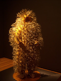
So I've posted pictures of the stuff I actually did like. Unfortunately, I have also completely forgotten all of the artists' names. I wasn't planning on a blog post when I took the pictures, so I didn't bother to write anything down. It's pretty much just stuff I liked. I realize now that, with the exception of the big mouse, I liked clothing. Apologies for the poor photos--they don't allow flashes in museums. Anyway, from the bottom up:
The sweater-and-hair suit-person was cute. Or anyway, I thought so. There was a brightly-colored one with a big columnar head/neck as well, but I liked the brown one. Both were approximately human size. The bristly gold wire suit was supposed to be evocative of conquistadors and caterpillars. There was a silver companion, and both were about 2-2.5 feet tall. The array of costumes are from an African (I forget the country. Sorry) festival and these seated ones are representative of the very participatory audience. There was one "father" figure whom no one at the festival is supposed to talk to, since he is too wise and such, so I didn't take a picture of him (though part of him is showing in the far right). The awesome metal coat is made entirely of dog tags stamped with nonsense words. And that above it is a REALLY BIG MOUSE.
I also got to see the museum's sculpture garden on Tuesday, which is not part of the museum complex proper but farther away down the road. It's quite nice, with neon orange chairs instead of regular benches. (This was also the day Obama was in town, and some private plane flew into the no-fly zone. About four minutes and several sonic booms later, the plane was escorted out by two F15s that came up from Portland. LOUD.) Seattle being a weird and layered sort of city, the garden was spread out over a highway. The runaway eraser (top, Claes Oldenburg, because who else) is situated on the embankment, as if it is about to roll into traffic.
So, Kurt-deification aside, I'd recommend the SAM and its satellites. It's manageable and easy to navigate, and seems to have a good selection of art. It's nowhere near as extensive (or exhaustive) as something like the Met, which is just as well for the strolling tourist. The Met makes me tired; the SAM didn't. And sometimes that's all I ask for in a museum.