


 Steve Heller lives in the Hudson Valley off Route 28, and creates sculpture and furniture from some unlikely materials, namely pieces of old cars and wonderfully twisted wood. I learned about Heller from the book Weird New York, which lists some of the various oddities in New York State and is all kinds of awesome, and is also where I learned about Rosemary's Texas Taco in Patterson.
Anyway, Steve Heller created the pieces seen here. The first one is a side table made from a maple burl. A burl is one of those lumpy things that occur on trees sometimes due to the wood grain growing irregularly (according to Wikipedia). Instead of avoiding these growths, Heller uses them to create furniture like this, which reminds people that trees are living things with bumps and irregularities like people, not simply smooth material with which to build. A table like this serves as a reminder that it was once alive.
He also makes large scale metal sculpture like this metal bird out of scrap. This one is called the Ostrichosaurus, and they seem to stand around his property and offer their input on things. These are purely aesthetic, but still retain the general theme of Heller's work, which is the reuse of items that would otherwise be considered unusable or undesirable.
The other material Heller uses are pieces of vintage cars, creating kitschy but functional home products. The front end of a 1957 Cadillac, for example, becomes a bar with a full set of shelving in the back for storage. The head- and taillights of a 1938 Packard become a "rocket lamp," and the hood of another car (whose identity I couldn't find on the site) becomes the lid of a red cedar chest. I would guess that things like this aren't for everyone, given their bulk and their general loudness, but they're pretty cool novelty pieces. His wooden furniture, which ranges from full-sized dining room tables to small mirrors, are a little more accessible and likely work better in a wider range of homes.
I have not been up to see Heller's place in person, although I'd like to and it would be fairly easy for me to drive up there. If I ever go, I'll be sure to take pictures.
 It's that time again--the shortest day of the year (in the Northern Hemisphere, at least, which is where I live), and time to appreciate the darkness and the coming light.
So to celebrate, here's a watercolor of me and some bony crows of winter enjoying the cold. I like the winter. I like all seasons, in fact, and I think it's kind of weird when people say they don't like a certain season. First of all, disliking a season seems pointless, because there's nothing you can do about it (except contribute to the greenhouse effect, I guess). Then there's the fact that I find the change of seasons refreshing, and I think I would get really bored if there were only one or two seasons. Four is a nice amount. Just when you're getting tired of one, it changes. When you're tired of the heat, summer's over and it's autumn. When you're tired of the cold, it's spring. And when you're tired of the changeable weather, it becomes either consistently hot or consistently cold. Right now it's cold and dark, and you can see all the lights for miles thanks to the relative clarity of cold air. And there are cookies.

Also just for fun here's a picture of Zooey Deschanel, (whose name I never know to pronounce "Zoh-ee" or "Zu-ee"), in all her horrifying glory. Seriously, lady creeps the shit out of me. I think it's her enormous, icy, soulless eyes and the fact that in every photo I see of her, she seems to be saying, "Boop!" while thinking about the inevitable invasion by her alien compatriots.
Plus I hate it when actors only play one type of role. I just want to see her play like a crack dealer or a ruthless assassin. Just once. Please?


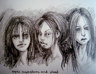 It was apparently a time for re-doing
  things. Sometimes spending some time apart from a piece of work allows you to see more clearly the problem areas, and then you can go back in and make the necessary adjustments. First up was Caligula Rape Face and his non PC title. Which is still the same, mind you. The original image, which I've uploaded here, was completed some time last summer (I think), and I was only partially pleased with it. But after spending so much time together, I couldn't think critically about it. So recently I gave him some major reconstructive surgery and I'm liking how he turned out. I fixed the face to better resemble the person it's based on, added detail to the face and hand, made the hair fluffier and added a yellow color, and made the body stand out more by adding white and blue glazes to the preexisting pink ones. I also fancied up his cross necklace a bit, and changed the bird skull into a rabbit skull. And of course I added MOAR glitter and some cute little pink heart sequins to the bottom. And yes, I'm still using Martha. I'm really happy with the face now, and the original looks totally crappy by comparison. This is also the first oil painting I've (re)completed in a while, which is a nice feeling. The next image isn't so much a re-do as a different version of a sketch. The original Sepsis, Sugarplums and Blood is a simple pencil sketch from my sketchbook (there's my curly little handwriting at the bottom), and was drawn after a weird night with some friends. I later developed it into a water media piece, using watercolor, ink, watercolor pencil and gouache on Arches paper. I didn't originally intend for them to have neon hair like that, but I like how it turned out. Also, I once did have purple hair like that. What I like about the two of these when seen side by side is the facial expressions, which are all different, but equally likeable. Each picture communicates a distinct mood, with the pencil sketch being somewhat sadder and more nihilistic (which was kind of how I was feeling after said night with friends), and the water media one is happier. I also thought the fly on the orange-haired one was a nice addition. That was Beast Boy's idea.

The following was taken from a journal entry, also called "I Hate Ponies," I posted to my deviantART account in a fit of gleeful rage. I was sifting through the front few pages of the site, which is a feat in itself, and getting more and more grossed out by the My Little Pony phenomenon. There's all kinds of creepy pny-themed shit out there. Most of it is fairly innocuous (though still weird and gag-inducing), showing happy, pastel-colored ponies doing anthropomorphic pony things. Fanart is lame, but whatever. Then I came across this image.
Seriously. What the fuck is this. It was created by this fucking creepy weirdo, who might have some artistic talent if they weren't so icky. I mean seriously. What the fuck. And yeah, I shamelessly ripped it off because whoever creates fucked-up pink pony girls deserves it.
It prompted me to write the following:
Okay, so what the hell is the appeal of the newest My Little Ponies series?
On the surface, I get it. It's got bright colors and some trippy animation that appeals to small children and stoned adults. Fine. That's great. When I was little, I fucking loved My Little Ponies. I had like 8,000 plastic ponies in various sugary colors that lived on my dresser, and they all had distinct names and personalities and had all sorts of adventures. I also did not watch the original animated series, which allowed me a certain freedom in their character conception. So yeah, I get it. Rainbow ponies are awesome. When you're six.
I also understand, to a certain extent, why people like to make art referencing their favorite cartoon characters. I'm not much into creating outright fan art (because, you know, I have my own ideas), but I get it that people are inspired by media that appeals to them. But I don't understand the fascination that compels people to dedicate SO much time to creating pony art. Like what the ponies would look like if they were humans (Spoiler alert! They have huge tits!) What REALLY creeps me out though are the images of sexy ponies, where little, brightly colored horses are put into sexual positions and giving the "come hither" look. That's fucking creepy. They're fucking ponies. Ponies. That's sick, bro(ny).
Also? To be perfectly honest? The cartoon show is crap. It's not funny, it's not well written, it's not anything but a bunch of anthropomorphized ponies with shrill voices delivering heavy-handed (hoofed?) life lessons. I got about four minutes into one episode and I was like, "That's enough of that." And this is coming from someone who waxes philosophical about 12 Oz. Mouse. Now, I understand that everyone likes different things, and that's what makes us a beautiful rainbow of humanity and all that shit, but I just don't understand why this franchise has such a dedicated and frankly downright creepy following. I think it's creepy when people create sexual-fantasy-esque images of, say, anime characters, but at least those are humans, or at least humanoids. That makes sense to me. Why the fuck are you drawing Moonlight Buttermoose or whatever the fuck laid out on a bed with her ass in the air? What the fuck is wrong with you?
For the record, and despite the title of this entry, I don't actually hate ponies. Not real ponies, anyway. I spent a summer at a farm camp when I was seven or eight in the company of a 45-year-old pony (if you don't know, that's REALLY OLD in pony years) named Checkers. Checkers was pretty awesome. He was all gray in the face and ambled around and munched on things and was very friendly towards everyone. I'm only sorry that Checkers' memory is being tainted by candy-colored zoophiles. Fuck you guys.
 I really like Kidrobot. They are, I know, a complete waste of money in reality, and do nothing but add to the clutter on my top shelf. But I love them. I love that they send me free keychains with my order and I love the anticipation of a blind box purchase.
So here are some of the do-it-yourself models they offer. The one on the left is a Rooz model, and is some kind of mystical forest spirit. The one on the right is a Trikky model, and is an intergalactic graffiti artist. They go very nicely together, and I like to think they have many adventures. I determined their personae by the accessories they came with--a stick (Rooz, seen here), and a spray paint can mounted on a stick (Trikky, not shown because it gets in the way of its face).
Everything done with markers, Munnyworld, Prismacolor, and Sakura Microns. Figures are vinyl.
 Actually, I think this picture is really nice. I like it a lot. I'm calling it Rabbit Eater II, and I have a few more rabbit eaters planned. The first official Rabbit Eater can be seen here, but I think that the original concept actually dates back to the Woods series, with images of my rather toothy significant other. In a way, I think it hearkens back to the Woods series very much, with the branch patterning and the coloration. Here he's looking a bit blonder, and he's thoroughly enjoying his meal of rabbit. The idea of him eating rabbits stems from his penchant for chasing rabbits in the yard. Really. This was done with the usual mix of watercolor pencils, watercolors, gouache, and some inks on Arches paper (the most awesome paper ever that I got on sale for added awesomeness). The blood was fun to paint. Blood usually is.
This brings me, however, to something that's been bothering me lately. For the record, I really like this painting. I think it came out really nicely in terms of technique and how it captures the subject, and I therefore think it's a nice picture.
But that's apparently not the case.
When my mom saw this, she was quite vocal about the gore, and complained that it was "not nice." I'm like, yeah, Mom, biting the head off a rabbit usually isn't. (Our dog, as a side note, would disagree, as one of her favorite hobbies is snapping the necks of the bunnies that live in our yard.) This isn't the first time she's complained that the subject matter of my work isn't "nice," but rather "creepy," or "disturbing." Confounding this was the incident where my grandmother (my mother's mother) found an unfinished piece of a skullhead character, and basically said, "Why? Why would you make something so UGLY? Why can't you make something NICE? Art is supposed to INSPIRE." I was like, thanks, Nanna, you think my work is ugly, that's awesome. Luckily for both of us I intercepted her before she found Rabbit Eater II here.
But this is what bothers me. For one thing, art is supposed to cause a reaction in the viewer. It's supposed to make you feel something on a visceral level. It doesn't matter if the reaction is one of adoration or repugnance, it's supposed to cause a reaction. When my grandmother said that art was supposed to inspire, she was absolutely right, but what she didn't realize was that my unfinished skullhead had done just that; it inspired in her a strong reaction. Maybe not the reaction she wanted, but a reaction nonetheless. Simply looking at something and thinking, oh, that's pretty, isn't enough. You won't remember something you think is merely good-looking on a cosmetic level because it offers no real stimulus.
The other part of this is that I can't help but feel insulted by comments like these. Not because I need constant praise or that I want everyone to like everything I make, but rather on a deeper level. I don't always make "nice" images because the things that go through my head aren't always nice. They have to do with anger, fear, hatred, selfishness, and sadness sometimes, because these are things we all have to deal with on a daily basis. The things I think about are not always nice things, but they are real things, and they are worthy of exploration. To me, demanding that I only create "nice" imagery is like telling me that the less pleasant aspects of my psyche are not worth recognizing. It also suggests that my art is solely for the benefit of others, and not for myself. I understand that this is likely not the intent of my mom or grandmother, but that's how it feels. Making a less-than-nice image is cathartic, it helps me come to terms with the darker and scarier aspects of myself, and comes from a deep and intimate place. I can't help but feel that by deriding these pieces, they are deriding parts of me. And that kind of hurts.
I think that it's easy to want someone to always create "nice" images because that seems to communicate that the creator of those images is always happy. And of course we want our loved ones to be happy for the majority of the time. But you can't be happy without being unhappy. You need both, and we all need to accept the less-than-nice aspects of one another, because those are the aspects that make us human. Being able to recognize and express our own dark sides, through art or in other constructive ways, takes enormous strength, and makes us better people in the long run. Instead of demanding nicety, we should celebrate the not-so-nice, because it is just as important.


 While rummaging around in an antique shop in Cold Spring, NY (which by the way has about 10,000 antique shops, but this was the only good one), I found a pile of old photographs going for 25 cents apiece. I bought 25 of them, and talked the woman down to $5 for the lot. Some of them are nice the way they are, and I think I'll just mount them on some nice paper, but some, like these, seemed to need some embellishment.
Here are three of the decorated ones. They are collaged mainly with tracing paper that has been colored with pencils, as well as cut paper, and I've used ink, lead pencil and pen as well. In order, they're called Garden, 1945, and Wonder. I did not label 1945; it came that way. Wonder is my favorite so far, as I feel it really captures what I think of when I think of 1950s America, full of youth and hope and earnestness, but with this undercurrent of fear and impending doom. Wonder is sort of a child's idea of war and widespread destruction as something far away, almost like a fairy tale, romanticized in movies and television and abated in the adult world by those romanticized accounts, and by the idea of being righteous and wholesome. While the kid is thinking about war, it's clear that that kid is still innocent to its realities, but the point is that the society prefers to think of war as a fantasy.
The photos are images of various families, like the people seen in the first and third photo here. I have a few of the woman in Garden, one of which had been hand colored. There are also a few that appear to be photos of someone's WWII combat tour, a mountain, random awkward snapshots of babies and girls and families, and a very faded and weird-feeling nineteenth century group portrait. I would guess that they range in time, excluding the one from the 1800s, from the 1920s through the early 1960s. The woman at the shop told me that most came from a particular estate, and that she knew some information about the woman whose estate it was. I like to think this woman is the woman seen in the first photo here, but there's no evidence for that.
They were someone's memories at one time, but their original meaning has been lost, I suppose. All that's left of what they used to be is the image itself, without further context; all we can understand about them is what we see, and of course what we bring to them, because we are lacking any other information. All you can do is look at them and react emotionally, since that's all you have. And that's what I did here, essentially. I attempted to capture visually the feeling that each photo gave me. Garden is a family blooming out of the snow (see the dog at the far right, just next to the woman's shoulder), 1945 is a summer after a conflict, and Wonder is a child's brightly-colored imaginings about the world at large.
I was also pleased at the preexisting hoodie these pictures gave me.


