Sunday, December 9, 2012

endings, beginnings, and such

 It liiives!

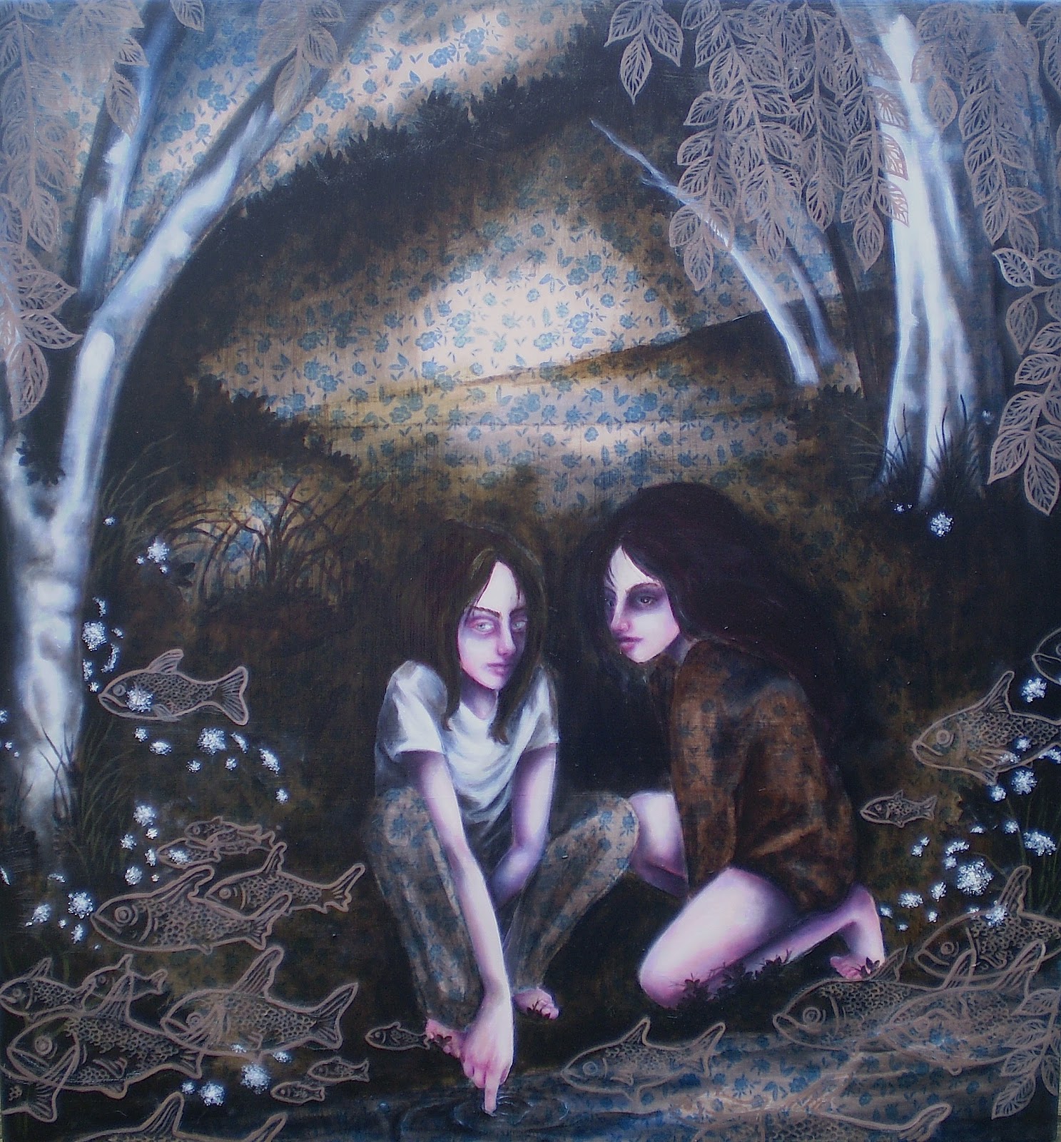
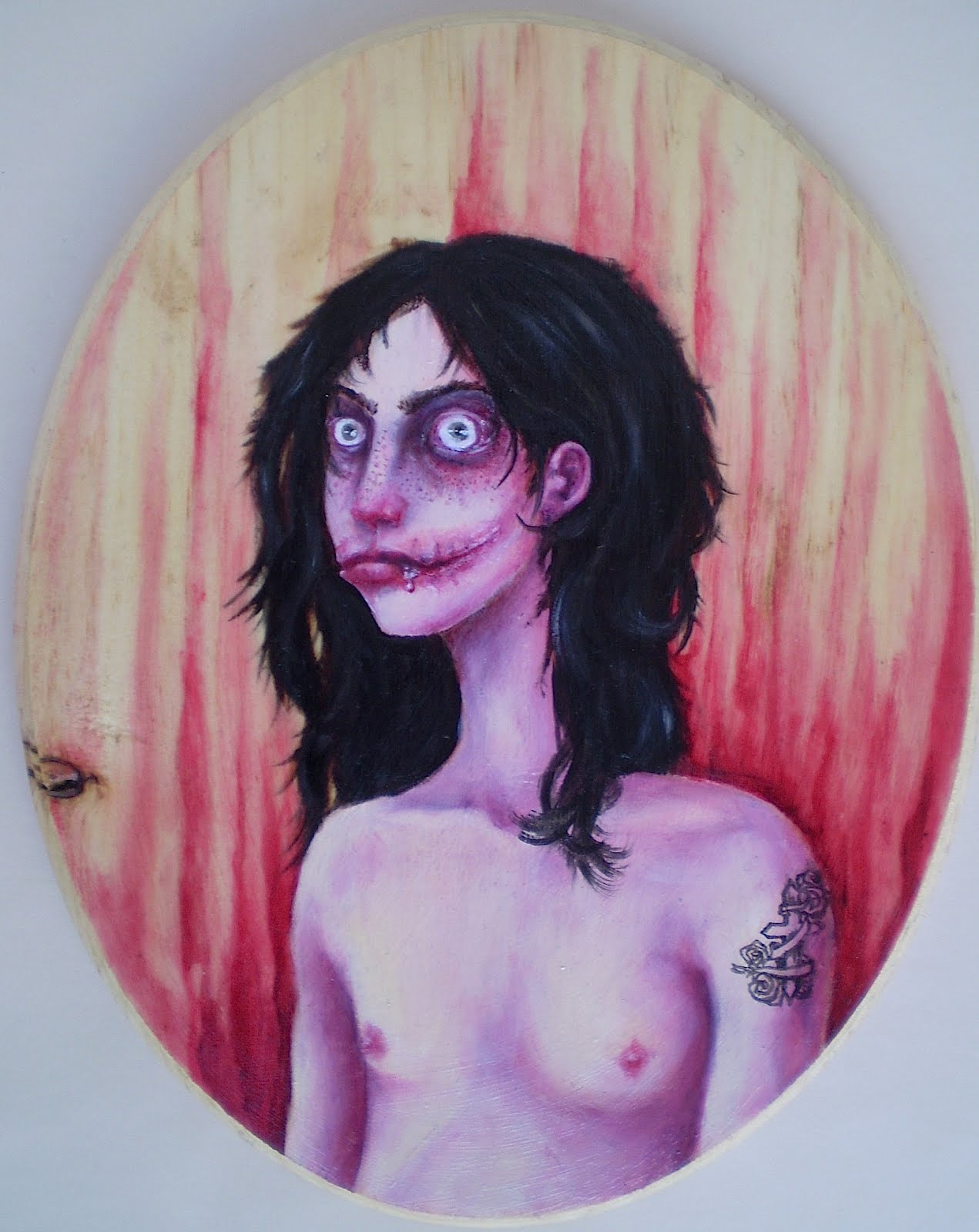
This blog, I mean, as well as my art-making. It's been going well, I guess. I had two gallery shows in the past two months, and have contacted another one regarding showing (haven't heard back, though). I've been working on two new paintings and am probably going to set up for a third, which will be nice and bloody. Yay!

In the meantime, have the first and second installments of a small illustrated story I've been working on. I'm calling it The End or the Beginning, because that's what it's about. 

See, I don't normally use art as a means to directly express things going on in my personal life. My personal life affects my art, of course, but I'm not usually prone to illustrating it literally. This series, however, is close to doing that. Obviously it's not literal literal (I don't know people who habitually wear burlap sacks on their heads), but this series is about something I went through over the summer, which was both an ending and a beginning for me. It also corresponds to some writing I did about that issue, and some of these images are direct illustrations of those writings. 

Again, I don't make comics, and this is probably the closest I can comfortably get to making something akin to a comic (Duck vs. Cactus notwithstanding). On a technical note, I'd like to bind these, but they're all on separate pieces of paper, and I'll have to finagle something.

Thursday, November 1, 2012

adulthood and hurricanes

 So it's been a while. 

That is, as I have said, what having a full-time job will do to you. I'm actually working RIGHT NOW, thanks to being stranded at home by a hurricane. 

And I finally finished a big oil painting! Up top here is Sing Sing Kill, which is named for the stream that runs through town and empties into the river. "Sing Sing," like the prison, is the Anglicized version of the Iroquois name for the region, meaning "stone on stone," and "kill" is the Anglicized version of the Dutch word for stream. I pass where the stream empties into the river every day at the train station, and it's kind of a shady, dark little place tucked between the tracks (which go over the stream), a water treatment plant and some old warehouses. But it's still pretty and full of wildlife. This painting was inspired by the river and its ecosystems, which I see every day from the train. It's a weird and forgotten place, but very pretty in a decaying sort of way. It seems that paintings like this are the evolution of the Home body of work, which seems to be branching out into dreamier places. The painting was also a real bitch to photograph thanks to glare, awkward brushstrokes that messed up the lighting, and hurricanes.

Below is a watercolor. I was never really into drips, but this was a planned drip, so I'm okay with it. I tend to need to plan things completely  or they turn into formless disasters. Anyway, I'm calling it Double Shell Homunculus after the Homunculus Nebula

So, thanks to my impromptu vacation, maybe I'll get a chance to do some more painting. Yay! 

Thursday, September 13, 2012

hmmm...

...whatever could I be working on that requires the Unabomber, forest spirits, antisocial octopodes, Akatsuki clouds, the Virgin Mary, atom bombs and Jeff the Killer?

Saturday, August 18, 2012

way down

So I've finally, finally been able to complete a new painting! This is Way Down in the Valley, a kind of spiritual successor to The Valley, which I completed a few years ago. It has the same elements, double portrait with skullheads, but this one is, um, better. 

These figures started off looking like this. Why would I create extremely detailed faces just to cover them with skull paint, you ask? Because I am quite out of my mind, obviously. But from a practical standpoint, it looks better. After all, if you apply face paint, you're applying it to a preexisting surface, full of color and texture, which will inform what the end result looks like. So that's what I did here. I created the faces, and then applied the makeup on top. Which I essentially explained in the last post. 

There's also glitter. I haven't used glitter in a while, which is a shame because glitter is singularly fantastic. 

The idea behind this painting is the same as the idea behind The Valley; it's about true love, and how loving someone truly means accepting the darker aspects of their person, going down into the valley with them and accepting the fullness of their personality and psyche, not just picking out the parts you're comfortable with.

an artist you should know: Sarah Joncas

 After shirking my "Artist You Should Know" duties for a long time, I bring you Sarah Joncas, whose work falls under the pop surrealism category. Using oil and acrylic, she creates complex, multilayered images of women, evoking several emotions at once, while still retaining a unique stylization. Often her work encompasses several styles, including pin-up, classic portraiture and painting techniques, and graphic elements. Her work can be slightly uncomfortable, and she plays with the traditional ideas of portraiture, femininity and beauty. I currently follow her work on deviantART and Facebook.

So! Here's a small sample of her work. From the top:


After Dark. This moody portrait reminds me of the other, unseen side of a classic beauty queen, lying alone in a darkened room, still wearing her dress and pearls. It's a quiet, contemplative moment that may also be a little morbid. 


I Think I'm Paranoid. I love the bold, graphic patterning here, especially in contrast to the more delicate elements of the figure and the moths. I also like how it's worked into the figure, making it seem as though she's blending into, or emerging from, the wall behind her. It's ostensibly a cheerful pattern, but in this context it's jarring and frenetic, adding to the sense of nervousness. 


I Think, Therefore I Am. She reminds me very much of kitschy, '60s-style housewifey goth, like Morticia Addams, complete with little cartoon bat wings accompanying her lightbulb. Her apprehension is palpable.


It Became Courtney Love. According to the description on the dA page, this was originally intended to be a picture of Norse goddess Freya. But now it's Courtney Love. I kind of couldn't pass up the opportunity to have a picture of Courtney Love here, because I do appreciate her so, but I also like the vulnerability in the face. 


The All Seeing. This is one of Joncas' more overtly surrealistic pieces, sort of a mashup of mysticism and pin-up girls. I feel like there are many interpretations that could come out of this image, with the eyes looking very flat and painted on (which of course they are, but in two ways), the fact that the figure is covering her real eyes, and the confusion as to what, or whether, she can see.


The Crow Charmer. It's similar to The All Seeing in its mystical element, but this one seems more traditional, calling to mind nature deities and animal familiars. While the pin-up style is still very evident, there's less modernity in this one, and the figure seems more sure of herself, surveying her dark realm.


Saturday, July 28, 2012

how to avoid having people try to talk to you

 Fangirlism has reared its ugly head once again, and I found myself with a new host of Jeff the Killer crap. Most of these were drawn on the train going to and from work, and I can tell you that drawing things like this is a great way to ensure that no one will sit next to you. 


All of them are Micron pen on some kind of non-special paper, all are about 3 X 5 inches. All were drawn on whims based on stupid shit I thought was amusing in passing. 


From the top: 


Jeff after a shower. He's a grimy dude most of the time, sleeps outside and often can be seen with dirt, twigs, dried blood and bugs in his hair. But occasionally he likes to clean up a bit and comb himself. That girl there might be Jane the Killer, who stars in an even less well-thought-out Creepypasta than Jeff, if that's even possible. Or it might just be a self-portrait.


 Coffee. This is the closest to the original image that I've ever drawn. Which isn't very. But check out that lettering fail. Lesson learned: Do not attempt lettering while on a moving train.


 Jeff and Jane (or whoever) again after a bout of stabbing or whatever it is they do to express their feelings about one another. The plants were fun to do.


Jeff drools. Jeff doesn't particularly care about his drooling problem, even though it's gross; he considers it a minor price to pay for his beautiful smile. The spiral there reads "smiley, smiley, smiley, smiley," because that was the song that serendipitously started playing on my iPod while I was working on this. 


Jeff goes hunting. Now, obviously, a knife has several advantages over a gun, especially if you're a serial killer. It's quiet, it doesn't require reloading and is easily cleaned, repaired, and concealed. But when a bunch of squealing fangirls are let loose in a nature preserve for an updated version of The Most Dangerous Game, Jeff prefers something more dramatic.


Jeff vs. Robert. If you've never seen Rubber, you need to. Basically, Jeff would not win this confrontation.


Finally, this is just inappropriate. And the sad thing is there's an even more inappropriate one waiting to be uploaded. Seriously I need help. But this is something that actually happens regularly, when certain significant others wake up in the night and peer creepily down at me for a few minutes and then have no recollection of it in the morning. It is so creepy. 


Sunday, July 1, 2012

knives

So I'm shirking my "Artists You Should Know" habit, but my brain is somewhat fried and I already know what to say about this piece, which I banged out on a whim. Next time.

In the meantime, have this.

I'm calling it With A Knife With A Bigger Knife, which comes from one of my favorite moments in The Venture Bros. It's oil, leaves, pen and bloody tissue on canvas. Yes, it's real blood, but it's not mine. And yes, I know using bodily fluids in art is very "art school," but at least it's not period blood, so that's a start.


I used acrylic gloss medium to glue and seal the tissue down to the canvas, which caused it to bunch up and shred a bit, but creates an interesting texture. Unlike my actual paintings, I didn't have a set plan for this one, and frankly I'm surprised that I'm pleased with the result, because usually when I don't plan ahead, it's a disaster.


I sketched out the portraits of me and Blood Donor in Micron pen, and doodled in some atmosphere and vegetal forms with oil, and applied some dyed leaves, again with gloss medium. 


Honestly? I have no idea about this one. 


I like it, I'm sure of that, but it seems to serve as kind of a place holder between larger, more serious pieces. It's a fairly straightforward double portrait of me and the boyfriend. We like knives. It was admittedly kind of a throwaway piece. It's very small, only about maybe 9X9 inches, and served as something of an experiment.


It's also thematically related to a larger piece I have planned, which will use the brown and blue color scheme, the double portrait, and a sense of the cycle of life and death (though this one is more death-oriented) and of being two small people in the world. 


The sad thing is, this is pretty much all I've been able to do now that I have a Grown Up Job which requires forty hours of each week plus commuting. The upside is that my commute is really nice, and part of that is the ability to sleep through parts of it; I take the train. The commute was actually, in part, what inspired the larger piece I mentioned above, as well as some writing. I've also taken a position as a contributor with an online publication, and recently got my first article published with them. So everything is pretty peachy on the "being an adult" front, but the drawback is that it leaves me less time for painting. Also, the access I had to a digital camera was again shot down by shitty technology, and so this, unfortunately, had to be taken with my iPod, hence the less-than-ideal image quality. I'm hoping to either get one or both of the cameras repaired and, if that fails, get a new camera. Although the prospect of blowing yet another paycheck isn't a welcome one.


And despite the knives, the blood was not acquired through any violence on my part. Today's lesson: don't try to shave when you're drunk.

Monday, June 4, 2012

experiments in pencil

So I don't normally use just colored pencil. I've had a box of Crayolas sitting in my desk drawer forever, and they've been relegated, for the most part, to the foundations of water media pieces. A long time ago, like back in middle school (which was over a decade ago, giving you an idea of how infrequently these things were used), I think they were used to flatly color in some bullshit faux-anime-style fantasy characters. Yeah. We're not getting into that. 

But I saw some colored pencil work online, namely this piece by a deviantART buddy (which is like, way, way more accomplished than mine here), and started to get interested. It helped that the figure pictured looks like Boyfriend. 

So what I've found after working with pencils is that they're just like watercolors! Just without the water. This is because with both media, you start with the lightest colors and build up to the darkest, with the paper itself serving as your white. It's basically the opposite of oils, where white and light colors are added last, as highlights. You can do that because oils are opaque, while pencils and watercolors are transparent. Make sense? Good. 

(Full disclosure: I cheat at water media by using white gouache for highlights, which is opaque. I can't help it. I'm an oil-painter at heart.)

The other thing is that I've been working on leftover scraps of Arches watercolor paper, which is wonderful for water media, but a bit rough for pencil, making it hard to get very fine detail. I'd like to try out a smoother paper and see what happens. I don't dislike the roughness, but I think I could get more out of a picture on a smoother surface. I have two other pencil pieces, but they were purely experimental and frankly kind of suck, so I'm not going to show them.

So yeah, I decided that for this piece I'd use my fallback subject of Boyfriend/Beast Boy and all his teeth. Yes, the size of his mouth and teeth are exaggerated for effect. But it's more about capturing the murderous rage personality. I've also been really into eyeballs lately, and capturing the correct shine. I've yet to hone the wet-shine look with pencils, as I'm used to just glopping on some white pigment.

Isn't he cute?

Tuesday, May 29, 2012

coming soon

 So I've been working on a few new things--mainly, two new things. And here's a sneak peak of one of them! 

Both pieces are oil on canvas, and for both I'm taking a very traditional figure-painting route, lots (and lots and lots) of glazing and attention to minute detail. I am really, really happy with how the eyes turned out. I spent a lot of time staring creepily into the eyes of friends and relatives to see how they look, where the highlights are, and how to create the sense of depth and texture in them. These are Neo Megilp glazes, but the painting will have some stand oil in it as well.

These photos are already somewhat outdated, as I've been working on these steadily for quite some time. I've lately been liking the sort of Renaissance-style approach to painting, with lots of underpainting and glazing, and a multi-step approach to creating the human form. Since skin is translucent, I feel it's the appropriate way to really capture the luminosity and depth of human flesh and faces--like the way light comes through the skin of noses and ears, and how the skin gets thin enough to see the blood vessels around eyes. I've always been impressed by paintings where, when you look at them, you know what the surfaces feel like, even though it's just mineral paste smeared on a piece of cloth. The Waterseller of Seville by Diego Velázquez is one that always struck me. Looking at it, you know exactly what those pitchers of water feel like; the one on the left is smooth, heavily glazed and somewhat hefty, while the one on the right is rougher, and cold from the water inside. You can feel the condensation on your hands. It's just amazing. 


Anyway, to get back to this painting, that's what I want to achieve, but with people. Oh, and I should mention that these faces are going to be covered by some skullhead makeup. Not entirely, I'm not masochistic enough to do all this work to completely mask it, but yes, they're going to have skullheads. So why am I doing all this work? Because it'll look better. Look, when you put makeup on, you have a face underneath. The colors and textures of that face inform what the makeup is going to look like, so it stands to reason that this would also be true in a painting. Don't look at me like that. I'm just being insane thorough. The skullhead bits are going to be a bit different from my older versions, though, lighter and more delicate and still leaving plenty of the skin on show. 

I can't wait for this to be done! Not out of impatience but out of excitement!


Monday, May 14, 2012

experiments in fabric

This is the newest in the larger-scale oil paintings I've been procrastinating working diligently on. This one is the largest, at 4 by 3 feet, and represents a few experiments. 

For one thing, it's painted on silk. Normally I work on printed cotton--stuff that I can find for fairly cheap at the local sewing supply store. I bought this piece at Mood Fabrics in the city and loved the pattern. Unfortunately, it's not smooth but has a sort of crinkled texture, which means that the painting has vertical lines running through it. Lesson learned: Buy untextured fabric. 

Silk, at least this silk, is also way more delicate than cotton, and so stretching it was kind of a pain because I was constantly afraid of tearing it, resulting in kind of a loose canvas. The texture also caused a it of a problem here because it allowed the fabric to stretch, but not quite evenly. 

This painting also features a collage in fabric. I had a bunch of oddly-shaped scraps lying around and thought to put them to good use. I think it turned out okay for a first attempt, though I think if I were to do this again I'd try to integrate them a little more into the composition. 

So as far as the painting itself is concerned, it's sort of a sequel to Big Wind, which I already think is positive in terms of its meaning, but this one is even more so. Look, renewable energy! And plump birds! Life is obviously good here. I was inspired to do something with wind turbines after looking at/reading about/writing about them so much for work, I decided I really liked them. They're so white and streamlined and smooth, so seemingly at odds with natural forms, and yet they manage to fit into natural settings so well. NIMBY might beg to differ with me on this, but I like them.

I've also noticed I'm becoming more atmospheric lately when it comes to skies. This isn't a great example, though, as I didn't want to cover up the fabric too much.  

(...also I don't like this new layout very much, Blogger. Why the small font so unreasonably small? Why are there enormous spaces between paragraphs?)

Friday, April 20, 2012

resistance is futile


Who doesn't love the Borg? The Borg always held a special place in my heart (the mechanical part) because despite their almost entirely ominous presence in Star Trek, there's something charming about them--almost silly.

This piece was created for a Star Trek/Star Wars-themed group show. Star Trek was sadly underrepresented because everyone is a Star Wars dork. I'll be the first to agree that the concept of a Borg Queen as seen in First Contact makes no sense, but she worked well for the image. I was going for the feeling of a propaganda poster, something advertising the pros of being assimilated. I kind of wanted to portray the Borg as they might see themselves, as kind of messianic, uniting the galaxy. Borg Queen herself was modeled on Mucha's females as well as Midna and some of the imagery* from from Zelda: Twilight Princess. I think I made the Queen much more stylish, plus I really like how the pixelated-type detailing of the dress came out.

I considered making some other sci-fi-themed images in the same stylistic vein, but was never able to. Honestly, I wouldn't know what to do.

*image credit Donna M. Evans, who I found via Google just now. That picture is super cute.

Wednesday, April 18, 2012

pinky


Okay, more fangirlism. I'm sorry.

No, I'm not.

Okay, so here's (probably) the last and most intricate piece I'll be displaying that has to do with Jeff the Killer. After viewing thousands of images of him and his supposed likeness on sites like deviantART, I found myself becoming irritated with many of the images because they seemed totally unrealistic, and I think I'm a hardcore realist at heart. So I decided, as I usually do when something pisses me off artistically, to take matters into my own hands.

This is the result. I first started off thinking about what would happen, after some time, to someone's face after they'd given themselves a Chelsea grin, and figured there would be a lot of scar tissue involved, as well as a considerable amount of regrowth. With a portion of the cheeks open past the natural boundaries of the mouth, someone like Jeff would also probably have something of a drooling problem. Ew. The eyes, of course, which are often portrayed as ringed in soot (the eyelids were, according to the Pasta, burned off with a lighter, though I still think that would cause irreparable damage to the eyeball itself), though after time they would only be surrounded by more scar tissue. I've seriously never thought about facial mutilation quite this much before.

The face itself is modeled after my own. One of the reasons why I like this character so much is because one of the core themes of his story is the concept of beauty, of finding one's own definition of beauty against societal odds, and relentlessly pursuing that idea. Thanks to my own body modifications, I've experienced the OH MY GOD WHAT DID YOU DO TO YOURSELF quite a number of times. It's hard to explain to someone who has a very fixed idea of what is and is not beautiful you idea of beauty, that beauty is subjective, not objective, and that one idea of beauty is no more or less valid than another. I also know how it is to feel as though the physicality you have is a liability, and how it feels to want to confront peoples' shitty and exploitative concepts of (female) beauty in an aggressive manner. There was one time, a long time ago now, when I had a passing fantasy about cutting my face open like that. I really did--I even wrote about it when I used to keep a journal. I'm not proud of it, but it's true. Nothing ever came of it because I have better self-control than that, but it's still part of my history.

If you don't know, a very distilled version of the Jeff story is that Jeff mutilated his own face and subsequently thought of himself as beautiful. This concept of challenging the commonly-held ideas of beauty, of forcing people to look at something they've been trained to see as ugly as something beautiful is interesting to me, because I do believe that the truly beautiful things are the things that make you think and feel deeply--and often, the truly beautiful things are going to make you uncomfortable, make you afraid, and make you hurt. You don't escape from real beauty unscathed. As I've said before, when it comes to creating art, I find it much more fulfilling for everyone to create something that is uncomfortable but stirring than pleasant but superficial. Beauty and terror and ugliness and transcendence, to me, are all wrapped up in another as facets of the human experience.

I also should tell you that I am way over-analytical and make a big philosophical deal out of things like Creepypastas.

And because of all that, Jeff looks something like me, with big lips, freckles, unkempt black hair, and dark circles under the eyes. I gave him light eyes, though, as it fit better with the original image. He's also got a tattoo for some reason, I couldn't tell you why, but I think it stemmed from needing something dark at the base of the image to balance out the hair.

From a technical standpoint, this is the first time I've used gloss medium (clear) on wood, which allowed me to work with the natural forms of the wood, which was nice. Besides, wood knots, like the one seen here, have a way of insinuating itself through many layers of paint, and so I figured I would work with it rather than fight it. I chose a pink scheme because it seemed natural, plus I really like what pink glazes do for skin tones. Because of the pink and the sort of low-brow inspiration for this piece, it's being categorized in the Trash body.


Today I bought another one of these wooden ovals so that Jeff can have a companion.

Sunday, April 15, 2012

maskies


Finally, a new oil painting. I have been shamefully remiss about painting, and so I'm thrilled to have a new one.

The working title for this is just "Little Maskies," which is stupid, but I'm having a hell of a time thinking of anything decent. It's oil (stand oil glazing) and glitter on canvas, and is based on a photograph I saw on Boyfriend's aunt and uncle's refrigerator in Pennsylvania. It was of their relatives or something on Easter, during an egg hunt, and they were wearing these weird masks and looking unsmiling into the camera. I only had a quick impression of the original, and this is what it became.

Photographing it was a pain; stand oil is so shiny that it's nearly impossible to get a picture without a glare. Even if you think the light is diffused and indirect, it'll show up as a huge, distracting glare in photos. After about 24,596,984 times, I finally got this one, and there's still a glare on the left side. But it's okay.

I've lately been into paintings with large areas of amorphous, atmospheric, washy colors, which are dominating the projects I'm currently working on. I have two actively going and two more in the unstarted phase. I haven't worked with stand oil in a while and I'm excited to start up again.

In terms of the themes I usually work with, this one is a bit different. I'm categorizing it under the Home collection, but it has a number of differences. For one thing, much of the Home body was not created using stand oil, and none of them involve glitter. Glitter has been heretofore reserved for the Trash collection, but it shows up here, in the masks. The figures are different, too. They share some of the silhouette qualities of hoodies, but, obviously, have no hoods. They still, however, retain their air of mystery, having part of their heads/faces covered.

I also have a real thing for trees silhouetted against the twilit sky. It's just so pretty.

Saturday, March 31, 2012

an artist you should know: Marion Peck


As promised, here's another installment of Artists You Should Know to make up for my lack of talking about people other then myself.


Today we're
talking about
Marion Peck, a California-based painter whose work reminds me of a slightly unholy cross between Flemish Renaissance painting and seventies kitsch, complete with sad clown portraits (Polka Dot Clown, this one is called).

Her work's gentle pastels and the feminine detailing, as well as their "cute" figures with the large eyes, cartoonish proportions and clear skin belie the darker, more uncomfortable subject matter. There's also a weird balance in the paintings, I think. It's hard to tell if there's a lot going on--in terms of both symbolism and actual objects--or if they are empty and waiting for the viewer to project their own ideas into them. That idea, I think, is most evident in Landscape with Submerged Deer, where a deer reminiscent of kitschy figurines floats beneath a murky green lake surrounded by slightly disproportionately small mountains. It's like a snapshot from a dream. It seems like it must have a meaning, but does it? I know for me, it brings to mind the time I went swimming with some friends in High Falls, amid the rocks and waterfalls. On getting out to go home, we noticed a weird smell, and realized we had been swimming with a dead deer that was lurking in the water behind the rock where we had placed our clothing. A set of hooves floating in the green water.

It was a nice day anyway.

Anyway, Peck's work also balances the old with the modern. Her painting is undeniably modern, with the Kewpie-like human figures, but it also speaks to a much older tradition. The two paintings of single female sitters, Fuck You and Gretchen, are both dressed in historical costumes; an empire-period shift dress for Fuck You, and a peasant dress and wimple for Gretchen. They could be traditional portraits in the historical sense, but they are both very much modern. Gretchen had the enormous head of a cartoon character, and Fuck You is flipping us off in a very nonchalant way. Finally, The Salmon Spirit has some of the same qualities. The idea of an animal spirit is a very ancient one, as is the metaphor of the journey of the salmon (the banner reads "We begin/We journey/We return"). It calls to mind the indigenous cultures of the Pacific Northwest, but at the same time, the child floating above the salmon has a modern, blunt-bob hairstyle and the face of a baby doll.

Peck's work shares many traits with the so-called "lowbrow" artist movement: big eyes, kitschy elements, lots of pastels, etc. I tend to like these artists, and I like Peck because unlike some of the artists associated with the movement, her work shows a little more variation. I also appreciate the influence of Flemish painting in her earlier work, where landscapes through windows serve as the backdrops for her figures.

Sunday, March 25, 2012

an artist you should know: Matthew Gray Gubler


Holy shit I forgot about artists you should know. My plan was to post a piece on an artist I appreciate after every five posts about me. That quickly fell apart, and I realize now I've gone ten posts without talking about someone other than myself. So I'm going to post two consecutive pieces on artists you should know.

So today we're talking about Matthew Gray Gubler. You might know him from CBS's Criminal Minds, which I will only watch to look at him,and he was also, at one time, a fashion model. His name is also really fun to say.


He's also FUCKING INSANE.

So naturally I have a bit of a crush on him, because I apparently have a thing for deranged people.

Here are some of the things from his website. The top tow pictures show some rather imaginative finger puppets. I think the purple one is a louse? And then there's an explanation of Gublerland's top hat foundry. I took screenshots of these because I guess I'm not
technically supposed to copy/paste images of his stuff. SORRY GOOBS. But it's just too amazing to pass up.

To get more of your Gubler on, you can also check out his Tumblog and his YouGubeTube channel, if you'd like to see footage of him singing karaoke while dressed like a turtle.

of wolves and foxes


I had some trouble classifying this painting (and I do so love to classify), because its attributes fall into both the Home and the Medieval categories of my painting. It's on fabric, and features the painting style that I usually use for the Home pictures, but the clothing and composition, as well as the inspiration, are more in keeping with the Medieval style.

The title, Ai Vis Lo Lop, is Old Provencal and translates to "I saw the wolf." It's also the title of a song, which was the inspiration for this piece. Here are the wolf and the fox, meeting under the tree. There's also a rabbit mentioned in the song, but I think they ate it. Fun fact: the term "seeing the wolf" was also a slang term for losing one's virginity. So take that as you will.

I had a lot of fun painting this one, and I'm very happy with how the faces came out in particular, and I tried to keep them as close to the sketch as possible. I really like using pink in faces. That's me on the left as a little black fox, and Beastie on the right as a gray wolf. This was also the first time since I was about six that I've drawn anybody with animal ears, and I was a bit apprehensive about it, especially after seeing all the furry/anthro/neko-neko-kawaii bullshit the Internet has to offer. I like them, though, and I was thinking of it in terms more of medieval-style pageantry than literal anthropomorphism.

Friday, March 9, 2012

tales from the sketchpad, part 6


The time has come to end the sketchpad series. It's sad, I know, but my poor pens are suffering from exhaustion and quite frankly, I'm tired of the sketchpad. Like, really tired.

So here are the last two pages of the sketchpad. My .01 pen was fading fast, so as you can see, I resorted to using a .08 for the backgrounds of both of these. I don't like the heavier line quite as much as I do building up layers of finer lines, but it's passable.

Up top we have another Jeff. Seriously I am the sickest fangirl for him, because I have a thing for long-haired guys with crazy eyes, toothy smiles and big knives. I don't know what that says about me, exactly, but I'm okay with it. He's seen here after a long and productive night cleaning his knife off. Pasta-monsters have a pass when it comes to blood-borne diseases. Jeff's .08 background actually came from necessity, as there was some Prismacolor marker bleed-though from the other side of his page that had to be covered. And you always have to cover up the bleed-through, right Jeff?

Next is a portrait of me and Beasty. I'm not 100% thrilled with this one, but I wanted a picture of the two of us and here it is. I struggled with this for a long time, going through about a thousand pencil versions--the remnants of which you can still make out in the white areas of the image--before settling on this one. I was originally going for something a little sexier, but it never quite worked the way I wanted.

I salute you, Sketchpad. You will be missed. Kind of.

Sunday, February 26, 2012

little watercolors


Here are some watercolors I had kicking around because I am tired of talking about the Sketchpad. (There will be one more sketchpad entry, and then we're done. Done, I tell you.)

First we have a very, very civilized portrait of Beasty, where he is looking very proper and wearing clothes. He looks nice in blue. The subject however, was critical of this piece. His critique was WHY DID YOU MAKE ME A BLOND WOMAN?

The second piece was done for a Hitchcock-themed group show. This is inspired by Rope, which is not one of the movies everyone thinks of when they think of Hitchcock, but is really quite good. This piece now belongs to my friend. It's a bit more cartoony than I usually go, but I think it works. I also think I got the expressions of the characters right: reluctant follower on the left, smug douche on the right.

I have a bunch of big oils paintings in the works, but I have to figure out a way to photograph them since the autofocus on my camera is still auto-fucked. I will likely borrow my mom's camera, but I really dislike that camera. Oh well. It will have to do.

Thursday, February 23, 2012

dolls are still fun


I made another one!

I've lately been slightly obsessed with Creepypastas and in particular with Jeff the Killer. I don't know why, I just really like him and think he's adorable. I'll admit to having a little bit of a crush on him. So, like one does when one has a crush on a fictional character, I decided to make a doll of him.

Maybe I do spend too much time on deviantART.

Jeff here was also a Monster High doll before his makeover. I don't remember which one. I sanded the face off and cut off all the hair and repainted him using watercolors, gouache and chalk pastels, just like the other one. Jeff, in canon, (if Creepypasta can be called canon), has a Glasgow grin and lidless eyes. I created the mouth by lining its edges with glue--this created the sense that his teeth were behind his cheeks, and made his skin look extra scarred and nasty. I also scalpeled his nose and jaw a bit. The doll, in true Mattel style, was molded to be some kind of square-jawed, hyper-masculine dudebro type (which clashed oddly with the thin, long-legged and rather feminine body mold), the kind I, as a female, am apparently supposed to find attractive. I, however, prefer my men to have a narrower jawline, so I tried paring him down with an Xacto. It didn't do much. Jeff is also supposed to be lacking a nose, though I have a problem with this as it doesn't really make sense. (I mentioned before that the original Jeff Creepypasta is nonsensical bullshit, so I don't pay much attention to it.) Anyway, if I took the nose off the doll it would have a hole in its face, which I wanted to avoid, so I just flattened it a bit.

The hair was interesting. Originally the doll had shortish black hair with a blond fringe (stupid-looking), and something like wax had been applied to it to hold it in place. I cut the hair off, rendering him bald. The hair you see here is actually the hair I cut off the first doll (and saved in an envelope marked CREEPY DOLL HAIR). It took a bit of thinking, but I managed to come up with a way to create what is essentially a doll weave. First, I separated the hair into flat sections, then melted the ends on one side with a lighter to create a fringe of hair that would lay flat. I think this is known in the fake hair business as a weft. Anyway that's what I was calling them. The hair melted wonderfully, and ended up being pretty stable. Then, I sewed a piece of tulle to the doll's head, fitting it on like a bathing cap. I was then able to sew the hair wefts to the tulle, sewing around the fused edge to keep it in place. He has a bunch of them and it took a while, but I think he looks pretty good.

As far as clothing goes, poor Jeff remains naked. He's supposed to wear a white hoodie and a pair of black pants, but my sewing skills, particularly on such a small scale, are not good enough to make anything convincing.

He looks happy enough, though.

Sunday, February 12, 2012

tales from the sketchpad, part 5


Two posts in one day? What is this?

So there aren't many pages left in the old sketchpad, and so our tales will be winding down soonish. But here are some more lovely pictures of Boyfriend. Isn't he the cutest?

The first one is what would happen if you crossed Jeff the Killer with The Rake. Because you know what you get? The Jake. Get it?
It's funny because that's his name. And because he really looks like this. Shortly after I drew the first image, he was chasing me around, as usual, and then he stopped and said thoughtfully, "You know, I finally get why you always draw me as a creepy animal."

I was like, wow, took you long enough.

Shortly thereafter he requested another portrait where he looked a little more dignified. He said he wanted to be shown wrapped in his dead animal blanket (it's fur, I don't know what kind) with some kind of bone decoration. So here he is relaxing in the evening. I like to think he's saying, "Hi there, why don't you sit down and relax and have some wine. Of course it's not really wine, it's the blood of your loved ones for I am The Jake." It's hard to see but his necklace is a human hand.

He's so great.

(Also, I've been reading a lot of Creepypasta lately. I really like Jeff the Killer, he's adorable, but his backstory blows. It makes like zero sense. I wrote him a new one over on deviantART and he'd better fucking appreciate it.)

dolls are fun


So I was looking through dA the other day and I noticed that people were doing really interesting things with Mattel's "Monster High" line of dolls. If you don't know, Monster High is this god-awful franchise involving teenage-girl versions of classic horror movie monsters. They all dress like hobags and the animated series actually causes brain damage. Seriously. It makes My Little Pony look like Shakespeare.

SO I convinced Boyfriend to come with me on a quest to WalMart to find one of these hideous little dolls. The Monster High section had been completely demolished by the time we got there, though. There were literally 2 dolls left. I have to admit it was fun buying a doll. I haven't bought a doll since I was like 10 so it brought back some nice memories of pulling limbs off my Barbies.

Then came the process of sanding and repainting the doll. First, I cut all of the hair off. I saved it in an envelope marked CREEPY DOLL HAIR because I plan on using it for another doll. Then I sanded the eyes and lips off, and sanded the body as well so it would take paint better. Sanded-down plastic smells like shit, in case you're wondering.

After that came the recoloring. I used chalk pastels for the base coats, scraping the pastels with a scissor to get a fine dust, and then applying it with a paintbrush, which was something I learned from various tutorials on YouTube. The detailing was done with watercolor. In between steps I sprayed it with acrylic sealant (outside, you don't want that shit in your house). The body was harder to paint than the face, being made of hard, smooth plastic, but I managed to get a nice emaciation thing going--not hard, considering the bizarre proportions of these dolls. I also carved in some wounds on the chest and back, and painted them red and gross.

The clothing is made from an old T-shirt. The arms, head and legs are wrapped in strips of it, and a sort of kirtle over it. The clothing is sewn on, and I don't plan on removing it, although it does cover the wounds. The gold cross is glued on, and was actually the strap of the purse that came with the doll. The triangle in the middle was also a doll accessory, in this case a bangle. Weirdly enough, the outfit was inspired by one of the costumes in Lady Gaga's "Judas" video. Hers, of course, is a bit more plush.

The idea for the doll was a religious fanatic who practiced mortification of the flesh as a way to achieve spiritual growth. This one likes self-flagellation and fasting. I already have another on planned, and just picked up a doll from Amazon. It's going to get a face full of hot glue. I am excited.

Friday, February 3, 2012

tales from the sketchpad, part 4


So I really dislike Twilight. Like, a lot. For a variety of reasons, most of which can be echoed on a certain Tumblr blog I frequent.

And after completing the "Bella Sucks" meme that I found on deviantART and having a lot of fun, I decided to elaborate on a particular image on page 2 of the meme that filled me with glee. Out came the sketchpad.

So here's Beast Boy in all his feral glory upon discovering the invasive activities of one of our newer, more sparkling pop-culture figures (because I cannot, in good conscience, call him a "literary" one) and taking action.

Aw.

Monday, January 30, 2012

tales from the sketchpad, part 3


The sketchpad returns!

Today in the world of sketchpad, we'll be looking at my three most recent drawings. This is what I've been doing instead of working on my Sketchbook Project, which is supposed to be postmarked tomorrow in order to be part of the tour. Trouble is, I hate the sketchbook and everything in it because the paper is horrid quality and makes everything suck. I just can't send it in. I just can't. It looks like crap.

So I've been drawing instead on some actual paper and I came up with these little beasties. I used an 01 Sakura Micron pen, and the paper is 80 lb. Strathmore, and I'm really happy with how they came out.

Top one is Lost Girls, who are skullheads, and began as a possible painting sketch about girls who disappear. Next is Sea Beast, which is essentially a self-portrait. At least, that's what my hair looks like after a day at the beach. Finally we have Land Beast, who is like Boyfriend if Boyfriend was the Rake.

He's so cute.

Overall, I'd say I'm pleased with how my pen use is evolving, as opposed to the last times I've used this sketchpad. It's become more painterly, in a way, and less dependent on clean linear forms, less controlled. I'm liking the depth I've been able to create with these, as well as the variations in tone.

I already have some more of these planned!

Friday, January 27, 2012

things to come


So my camera is still broken.

So here we have some images from my Instagram account (Earlybird filter FTW), of some of the sketches for projects I've been working on. The top two are from the same piece, and the bottom one is a second piece. Both are oil on patterned fabric, and both are coming along nicely. It's been a while since I've painted on fabric and it's a lot of fun. The first piece is looking good (I started it today), and I actually really like the sketch. Normally my sketches are just maps, but I really like how the faces turned out, and will be attempting to recreate them in the final painting. The second piece is quite an experimental one, and I'm happy so far with the results.


More soon!